Feedback & Data
Alerts, cards, accordions, carousels, tables and custom scrollbars.
Alerts
DocsAlerts provide contextual feedback messages for common user actions. They can display success, warning, error, or informational states using flexible styles.
Subtle variant
<div class="alert alert-subtle" role="alert">A simple neutral subtle alert!</div>
<div class="alert alert-subtle-primary" role="alert">A simple primary subtle alert!</div>
<div class="alert alert-subtle-secondary" role="alert">A simple secondary subtle alert!</div>
<div class="alert alert-subtle-info" role="alert">A simple info subtle alert!</div>
<div class="alert alert-subtle-success" role="alert">A simple success subtle alert!</div>
<div class="alert alert-subtle-warning" role="alert">A simple warning subtle alert!</div>
<div class="alert alert-subtle-danger" role="alert">A simple error subtle alert!</div>
Filled variant
<div class="alert" role="alert">A simple neutral alert!</div>
<div class="alert alert-primary" role="alert">A simple primary alert!</div>
<div class="alert alert-secondary" role="alert">A simple secondary alert!</div>
<div class="alert alert-info" role="alert">A simple info alert!</div>
<div class="alert alert-success" role="alert">A simple success alert!</div>
<div class="alert alert-warning" role="alert">A simple warning alert!</div>
<div class="alert alert-danger" role="alert">A simple error alert!</div>
Outlined variant
<div class="alert alert-outline" role="alert">A simple neutral outline alert!</div>
<div class="alert alert-outline-primary" role="alert">A simple primary outline alert!</div>
<div class="alert alert-outline-secondary" role="alert">A simple secondary outline alert!</div>
<div class="alert alert-outline-info" role="alert">A simple info outline alert!</div>
<div class="alert alert-outline-success" role="alert">A simple success outline alert!</div>
<div class="alert alert-outline-warning" role="alert">A simple warning outline alert!</div>
<div class="alert alert-outline-danger" role="alert">A simple error outline alert!</div>
Alert with icon
<div class="alert alert-success" role="alert">
  <svg class="alert-icon" xmlns="http://www.w3.org/2000/svg" width="18" height="18" viewBox="0 0 24 24"><path fill="currentColor" d="m10.6 16.6l7.05-7.05l-1.4-1.4l-5.65 5.65l-2.85-2.85l-1.4 1.4zM12 22q-2.075 0-3.9-.788t-3.175-2.137T2.788 15.9T2 12t.788-3.9t2.137-3.175T8.1 2.788T12 2t3.9.788t3.175 2.137T21.213 8.1T22 12t-.788 3.9t-2.137 3.175t-3.175 2.138T12 22m0-2q3.35 0 5.675-2.325T20 12t-2.325-5.675T12 4T6.325 6.325T4 12t2.325 5.675T12 20m0-8" stroke-width="0.5" stroke="currentColor"/></svg>
  <span>Operation successful — everything is up to date!</span>
</div>
<div class="alert alert-info" role="alert">
  <svg class="alert-icon" xmlns="http://www.w3.org/2000/svg" width="18" height="18" viewBox="0 0 24 24"><path fill="currentColor" d="M11 17h2v-6h-2zm1-8q.425 0 .713-.288T13 8t-.288-.712T12 7t-.712.288T11 8t.288.713T12 9m0 13q-2.075 0-3.9-.788t-3.175-2.137T2.788 15.9T2 12t.788-3.9t2.137-3.175T8.1 2.788T12 2t3.9.788t3.175 2.137T21.213 8.1T22 12t-.788 3.9t-2.137 3.175t-3.175 2.138T12 22m0-2q3.35 0 5.675-2.325T20 12t-2.325-5.675T12 4T6.325 6.325T4 12t2.325 5.675T12 20m0-8" stroke-width="0.5" stroke="currentColor"/></svg>
  <span>Note the following — changes have been saved.</span>
</div>
<div class="alert alert-danger" role="alert">
  <svg class="alert-icon" xmlns="http://www.w3.org/2000/svg" width="18" height="18" viewBox="0 0 24 24"><path fill="currentColor" d="M12 17q.425 0 .713-.288T13 16t-.288-.712T12 15t-.712.288T11 16t.288.713T12 17m-1-4h2V7h-2zm1 9q-2.075 0-3.9-.788t-3.175-2.137T2.788 15.9T2 12t.788-3.9t2.137-3.175T8.1 2.788T12 2t3.9.788t3.175 2.137T21.213 8.1T22 12t-.788 3.9t-2.137 3.175t-3.175 2.138T12 22m0-2q3.35 0 5.675-2.325T20 12t-2.325-5.675T12 4T6.325 6.325T4 12t2.325 5.675T12 20m0-8" stroke-width="0.5" stroke="currentColor"/></svg>
  <span>Something went wrong — please try again later.</span>
</div>
<div class="alert alert-subtle-success" role="alert">
  <svg class="alert-icon" xmlns="http://www.w3.org/2000/svg" width="18" height="18" viewBox="0 0 24 24"><path fill="currentColor" d="m10.6 16.6l7.05-7.05l-1.4-1.4l-5.65 5.65l-2.85-2.85l-1.4 1.4zM12 22q-2.075 0-3.9-.788t-3.175-2.137T2.788 15.9T2 12t.788-3.9t2.137-3.175T8.1 2.788T12 2t3.9.788t3.175 2.137T21.213 8.1T22 12t-.788 3.9t-2.137 3.175t-3.175 2.138T12 22m0-2q3.35 0 5.675-2.325T20 12t-2.325-5.675T12 4T6.325 6.325T4 12t2.325 5.675T12 20m0-8" stroke-width="0.5" stroke="currentColor"/></svg>
  <span>Operation successful — everything is up to date!</span>
</div>
<div class="alert alert-subtle-info" role="alert">
  <svg class="alert-icon" xmlns="http://www.w3.org/2000/svg" width="18" height="18" viewBox="0 0 24 24"><path fill="currentColor" d="M11 17h2v-6h-2zm1-8q.425 0 .713-.288T13 8t-.288-.712T12 7t-.712.288T11 8t.288.713T12 9m0 13q-2.075 0-3.9-.788t-3.175-2.137T2.788 15.9T2 12t.788-3.9t2.137-3.175T8.1 2.788T12 2t3.9.788t3.175 2.137T21.213 8.1T22 12t-.788 3.9t-2.137 3.175t-3.175 2.138T12 22m0-2q3.35 0 5.675-2.325T20 12t-2.325-5.675T12 4T6.325 6.325T4 12t2.325 5.675T12 20m0-8" stroke-width="0.5" stroke="currentColor"/></svg>
  <span>Note the following — changes have been saved.</span>
</div>
<div class="alert alert-subtle-danger" role="alert">
  <svg class="alert-icon" xmlns="http://www.w3.org/2000/svg" width="18" height="18" viewBox="0 0 24 24"><path fill="currentColor" d="M12 17q.425 0 .713-.288T13 16t-.288-.712T12 15t-.712.288T11 16t.288.713T12 17m-1-4h2V7h-2zm1 9q-2.075 0-3.9-.788t-3.175-2.137T2.788 15.9T2 12t.788-3.9t2.137-3.175T8.1 2.788T12 2t3.9.788t3.175 2.137T21.213 8.1T22 12t-.788 3.9t-2.137 3.175t-3.175 2.138T12 22m0-2q3.35 0 5.675-2.325T20 12t-2.325-5.675T12 4T6.325 6.325T4 12t2.325 5.675T12 20m0-8" stroke-width="0.5" stroke="currentColor"/></svg>
  <span>Something went wrong — please try again later.</span>
</div>
<div class="alert alert-outline-success" role="alert">
  <svg class="alert-icon" xmlns="http://www.w3.org/2000/svg" width="18" height="18" viewBox="0 0 24 24"><path fill="currentColor" d="m10.6 16.6l7.05-7.05l-1.4-1.4l-5.65 5.65l-2.85-2.85l-1.4 1.4zM12 22q-2.075 0-3.9-.788t-3.175-2.137T2.788 15.9T2 12t.788-3.9t2.137-3.175T8.1 2.788T12 2t3.9.788t3.175 2.137T21.213 8.1T22 12t-.788 3.9t-2.137 3.175t-3.175 2.138T12 22m0-2q3.35 0 5.675-2.325T20 12t-2.325-5.675T12 4T6.325 6.325T4 12t2.325 5.675T12 20m0-8" stroke-width="0.5" stroke="currentColor"/></svg>
  <span>Operation successful — everything is up to date!</span>
</div>
<div class="alert alert-outline-info" role="alert">
  <svg class="alert-icon" xmlns="http://www.w3.org/2000/svg" width="18" height="18" viewBox="0 0 24 24"><path fill="currentColor" d="M11 17h2v-6h-2zm1-8q.425 0 .713-.288T13 8t-.288-.712T12 7t-.712.288T11 8t.288.713T12 9m0 13q-2.075 0-3.9-.788t-3.175-2.137T2.788 15.9T2 12t.788-3.9t2.137-3.175T8.1 2.788T12 2t3.9.788t3.175 2.137T21.213 8.1T22 12t-.788 3.9t-2.137 3.175t-3.175 2.138T12 22m0-2q3.35 0 5.675-2.325T20 12t-2.325-5.675T12 4T6.325 6.325T4 12t2.325 5.675T12 20m0-8" stroke-width="0.5" stroke="currentColor"/></svg>
  <span>Note the following — changes have been saved.</span>
</div>
<div class="alert alert-outline-danger" role="alert">
  <svg class="alert-icon" xmlns="http://www.w3.org/2000/svg" width="18" height="18" viewBox="0 0 24 24"><path fill="currentColor" d="M12 17q.425 0 .713-.288T13 16t-.288-.712T12 15t-.712.288T11 16t.288.713T12 17m-1-4h2V7h-2zm1 9q-2.075 0-3.9-.788t-3.175-2.137T2.788 15.9T2 12t.788-3.9t2.137-3.175T8.1 2.788T12 2t3.9.788t3.175 2.137T21.213 8.1T22 12t-.788 3.9t-2.137 3.175t-3.175 2.138T12 22m0-2q3.35 0 5.675-2.325T20 12t-2.325-5.675T12 4T6.325 6.325T4 12t2.325 5.675T12 20m0-8" stroke-width="0.5" stroke="currentColor"/></svg>
  <span>Something went wrong — please try again later.</span>
</div>
Alert with title
Warning
Please be cautious — review your actions.<div class="alert alert-subtle-warning items-start" role="alert">
<svg class="alert-icon" xmlns="http://www.w3.org/2000/svg" width="18" height="18" viewBox="0 0 24 24"><path fill="currentColor" d="M2.725 21q-.275 0-.5-.137t-.35-.363t-.137-.488t.137-.512l9.25-16q.15-.25.388-.375T12 3t.488.125t.387.375l9.25 16q.15.25.138.513t-.138.487t-.35.363t-.5.137zm1.725-2h15.1L12 6zM12 18q.425 0 .713-.288T13 17t-.288-.712T12 16t-.712.288T11 17t.288.713T12 18m0-3q.425 0 .713-.288T13 14v-3q0-.425-.288-.712T12 10t-.712.288T11 11v3q0 .425.288.713T12 15m0-2.5" stroke-width="0.5" stroke="currentColor"/></svg>
<div>
<h6 class='font-medium'>Warning</h6>
<span>Please be cautious — review your actions.</span>
</div>
</div>Alert actions
<div class="alert alert-subtle-warning" role="alert">
  <svg class="alert-icon" xmlns="http://www.w3.org/2000/svg" width="18" height="18" viewBox="0 0 24 24"><path fill="currentColor" d="M2.725 21q-.275 0-.5-.137t-.35-.363t-.137-.488t.137-.512l9.25-16q.15-.25.388-.375T12 3t.488.125t.387.375l9.25 16q.15.25.138.513t-.138.487t-.35.363t-.5.137zm1.725-2h15.1L12 6zM12 18q.425 0 .713-.288T13 17t-.288-.712T12 16t-.712.288T11 17t.288.713T12 18m0-3q.425 0 .713-.288T13 14v-3q0-.425-.288-.712T12 10t-.712.288T11 11v3q0 .425.288.713T12 15m0-2.5" stroke-width="0.5" stroke="currentColor"/></svg>
  <span>This is a generic alert — please take note.</span>
  <button class='btn btn-icon btn-icon-warning ms-auto shrink-0'>
    <svg xmlns="http://www.w3.org/2000/svg" width="16" height="16" viewBox="0 0 24 24"><path fill="currentColor" d="m12 13.4l-4.9 4.9q-.275.275-.7.275t-.7-.275t-.275-.7t.275-.7l4.9-4.9l-4.9-4.9q-.275-.275-.275-.7t.275-.7t.7-.275t.7.275l4.9 4.9l4.9-4.9q.275-.275.7-.275t.7.275t.275.7t-.275.7L13.4 12l4.9 4.9q.275.275.275.7t-.275.7t-.7.275t-.7-.275z" stroke-width="0.5" stroke="currentColor"/></svg>
  </button>
</div>
<div class="alert alert-outline-success" role="alert">
  <svg class="alert-icon" xmlns="http://www.w3.org/2000/svg" width="18" height="18" viewBox="0 0 24 24"><path fill="currentColor" d="m10.6 16.6l7.05-7.05l-1.4-1.4l-5.65 5.65l-2.85-2.85l-1.4 1.4zM12 22q-2.075 0-3.9-.788t-3.175-2.137T2.788 15.9T2 12t.788-3.9t2.137-3.175T8.1 2.788T12 2t3.9.788t3.175 2.137T21.213 8.1T22 12t-.788 3.9t-2.137 3.175t-3.175 2.138T12 22m0-2q3.35 0 5.675-2.325T20 12t-2.325-5.675T12 4T6.325 6.325T4 12t2.325 5.675T12 20m0-8" stroke-width="0.5" stroke="currentColor"/></svg>
  <span>This is a success alert — you can continue.</span>
  <button class='btn btn-sm btn-success ms-auto shrink-0'>Continue</button>
</div>
<div class="alert alert-danger" role="alert">
  <svg class="alert-icon" xmlns="http://www.w3.org/2000/svg" width="18" height="18" viewBox="0 0 24 24"><path fill="currentColor" d="M12 17q.425 0 .713-.288T13 16t-.288-.712T12 15t-.712.288T11 16t.288.713T12 17m-1-4h2V7h-2zm1 9q-2.075 0-3.9-.788t-3.175-2.137T2.788 15.9T2 12t.788-3.9t2.137-3.175T8.1 2.788T12 2t3.9.788t3.175 2.137T21.213 8.1T22 12t-.788 3.9t-2.137 3.175t-3.175 2.138T12 22m0-2q3.35 0 5.675-2.325T20 12t-2.325-5.675T12 4T6.325 6.325T4 12t2.325 5.675T12 20m0-8" stroke-width="0.5" stroke="currentColor"/></svg>
  <span>Error occurs - Try again.</span>
  <button class='btn btn-sm btn-text-danger text-inverse hover:bg-danger-dark ms-auto'>Start</button>
</div>
Dismissing
Holy guacamole! You should check in on some of those fields below.
<div class="alert alert-subtle-warning fade show" role="alert">
  <p class='mb-0'><strong>Holy guacamole!</strong> You should check in on some of those fields below.</p>
  <button type="button" class="btn btn-icon btn-icon-warning shrink-0 ms-auto" data-bs-dismiss="alert" aria-label="Close">
    <svg xmlns="http://www.w3.org/2000/svg" width="16" height="16" viewBox="0 0 24 24"><path fill="currentColor" d="m12 13.4l-4.9 4.9q-.275.275-.7.275t-.7-.275t-.275-.7t.275-.7l4.9-4.9l-4.9-4.9q-.275-.275-.275-.7t.275-.7t.7-.275t.7.275l4.9 4.9l4.9-4.9q.275-.275.7-.275t.7.275t.275.7t-.275.7L13.4 12l4.9 4.9q.275.275.275.7t-.275.7t-.7.275t-.7-.275z" stroke-width="0.5" stroke="currentColor"/></svg>
  </button>
</div>
Card
DocsCards are a flexible container that group related content and actions together.
Basic card
Basic Card
Card Title
Subtitle
Some quick example text to build on the card title and make up the bulk of the card's content.
<div class="card max-w-72">
  <div class="card-header">
    <p class='mb-0'>Basic Card</p>
  </div>
  <div class="card-body">
    <h6 class="card-title">Card Title</h6>
    <p class="card-subtitle">Subtitle</p>
    <p class='mb-0'>Some quick example text to build on the card title and make up the bulk of the card's content.</p>
  </div>
  <div class="card-footer">
    <button class='btn btn-sm btn-subtle-primary'>Learn more</button>
  </div>
</div>
Media
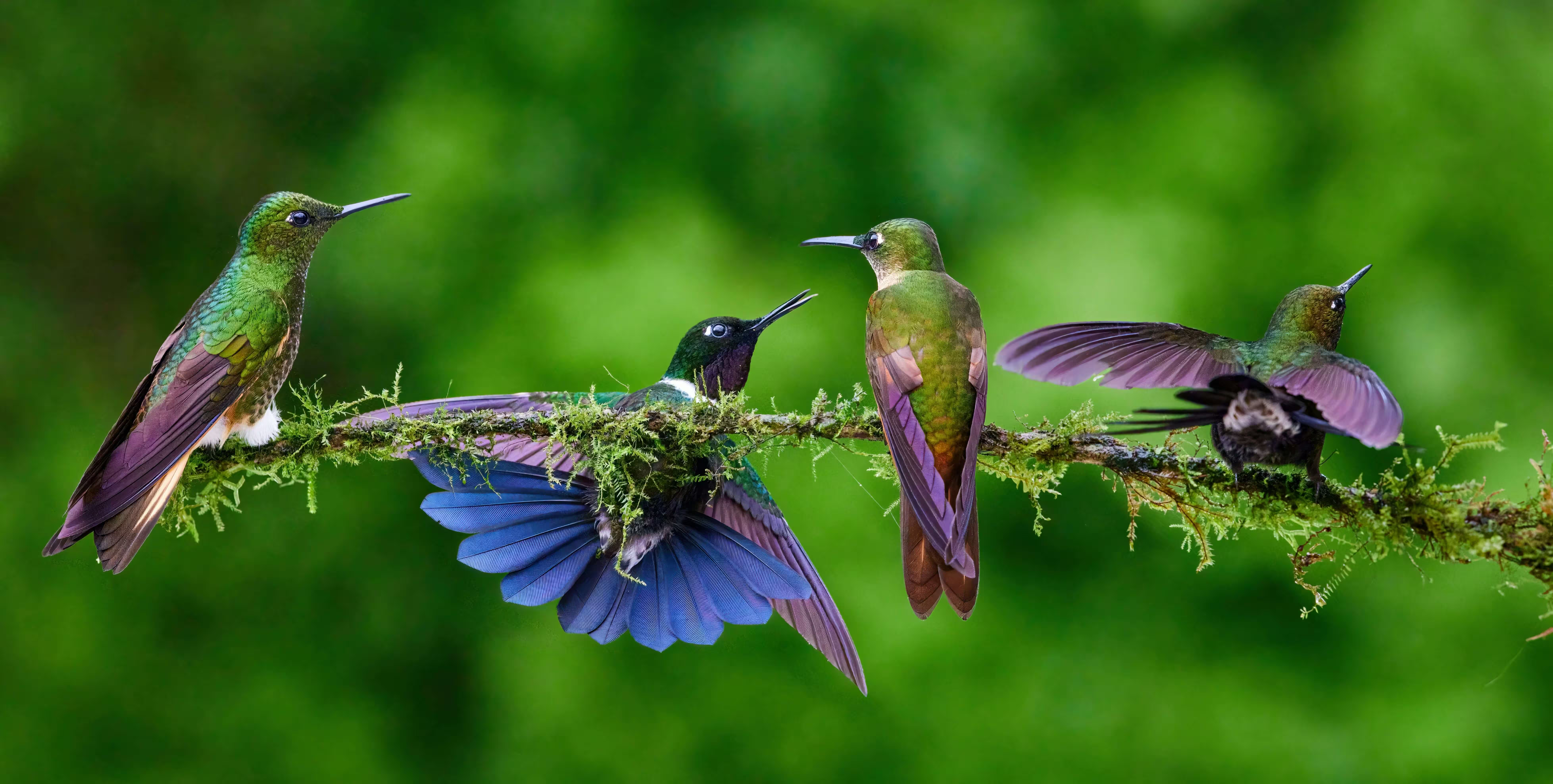
Hummingbirds
Hummingbirds belong to the avian family Trochilidae, and their closest relatives are the equally fascinating swifts.
<div class="card max-w-88">
  <img src="/images/1.avif" alt="Hummingbird" class="card-img-top" />
  <div class="card-body">
    <h6 class="card-title">Hummingbirds</h6>
    <p class='mb-0'>Hummingbirds belong to the avian family Trochilidae, and their closest relatives are the equally fascinating swifts.</p>
  </div>
  <div class="card-footer">
    <button class='btn btn-sm btn-subtle-primary'>SHARE</button>
    <button class='btn btn-sm btn-subtle-primary'>LEARN MORE</button>
  </div>
</div>
Clickable card
<a href="#" class="card card-action max-w-88">
  <img src="/images/1.avif" alt="Hummingbird" class="card-img-top" />
  <div class="card-body">
    <h6 class="card-title">Hummingbirds</h6>
    <p class="mb-0">Hummingbirds belong to the avian family Trochilidae, and their closest relatives are the equally fascinating swifts.</p>
  </div>
</a>
Complex interaction

Black-throated Mango male
November 10, 2021
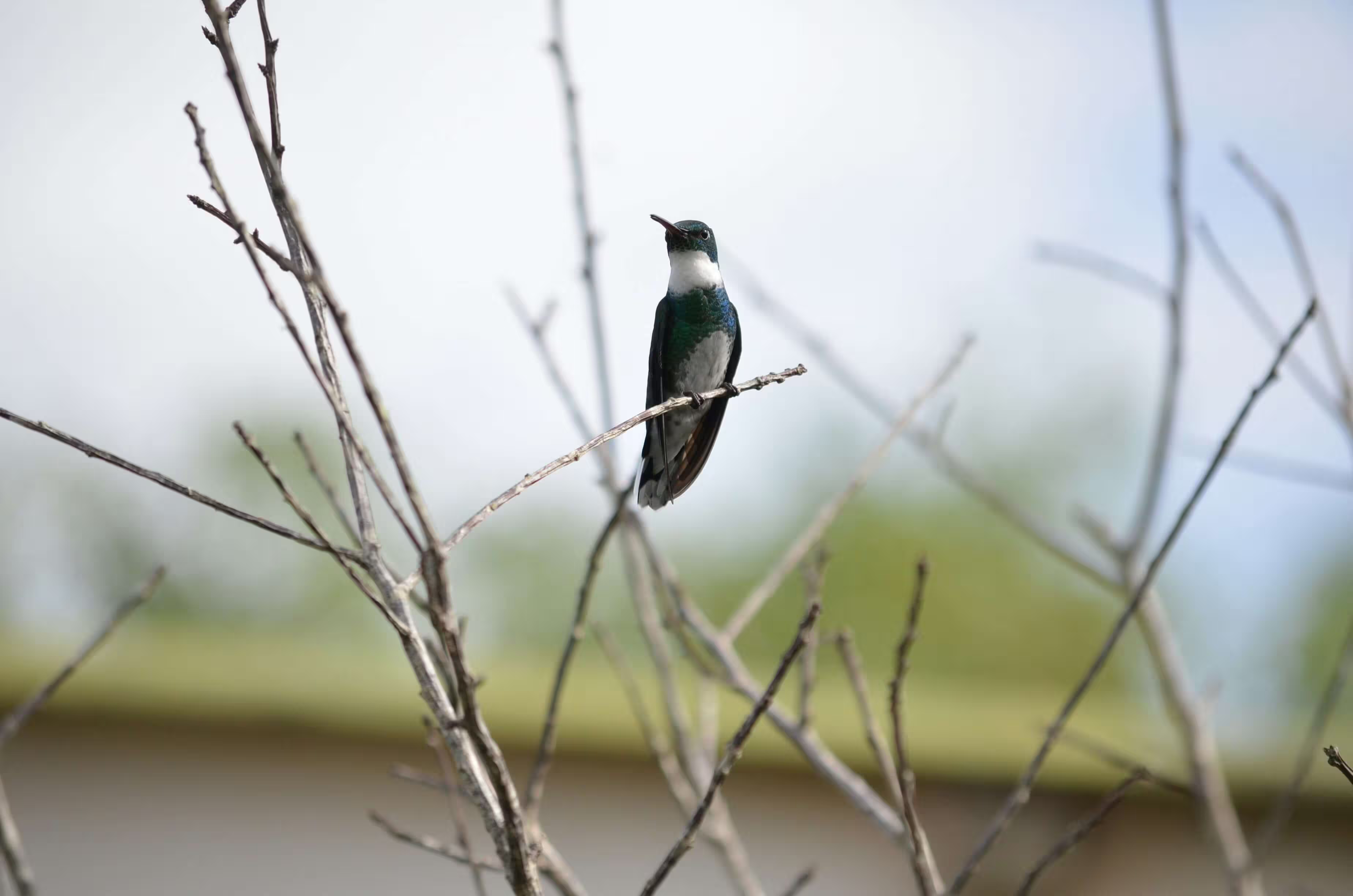
The male Black-throated Mango hummingbird has a metallic bronze-green upper body and flanks, a black throat and chest, and white underparts.
About
The Black-throated Mango (Anthracothorax nigricollis) is a striking species of hummingbird known for its bold coloration and confident behavior. The male is especially eye-catching, featuring a glossy black throat and chest that contrast sharply with its metallic bronze-green upperparts and clean white underparts.
Behavior & Feeding
Black-throated Mangos are known for their assertive and territorial nature. Males often defend nectar-rich flowers aggressively, chasing away other hummingbirds and even larger birds. Their diet primarily consists of nectar, but they also consume small insects and spiders, which provide essential protein.
Flight & Display
Like other hummingbirds, this species is capable of rapid wingbeats and remarkable aerial maneuvers, including hovering and backward flight. During courtship, males may perform short display flights to attract females, relying on both their iridescent plumage and agile movement to impress potential mates.
<div class="card max-w-88">
  <div class="card-header border-0">
    <div class="flex items-center">
      <div class="avatar avatar-lg me-4">
        <img src="/images/avatar/avatar_1.webp" alt="Avatar" class="rounded-full"/>
      </div>
      <div>
        <p class="text-default mb-0">Black-throated Mango male</p>
        <p class="mb-0">November 10, 2021</p>
      </div>

      <div class="btn-group ms-auto">
        <button type="button" class="btn btn-icon -mr-2" data-bs-toggle="dropdown" aria-expanded="false">
          <svg xmlns="http://www.w3.org/2000/svg" width="18" height="18" viewBox="0 0 16 16"><path fill="currentColor" d="M8 5a1 1 0 1 1 0-2a1 1 0 0 1 0 2m0 4a1 1 0 1 1 0-2a1 1 0 0 1 0 2m-1 3a1 1 0 1 0 2 0a1 1 0 0 0-2 0" stroke-width="0.5" stroke="currentColor"/></svg>
        </button>
        <ul class="dropdown-menu dropdown-menu-end">
          <li><button class="dropdown-item" type="button">View details</button></li>
          <li><button class="dropdown-item" type="button">Save to collection</button></li>
          <li><button class="dropdown-item" type="button">Report</button></li>
        </ul>
      </div>
    </div>
  </div>
  <img src="/images/2.avif" alt="Hummingbird" class='card-img' />
  <div class="card-body">
    <p class="text-sm mb-0">The male Black-throated Mango hummingbird has a metallic bronze-green upper body and flanks, a black throat and chest, and white underparts.</p>
  </div>
  <div class="card-footer flex">
    <button class='btn btn-icon'>
      <svg xmlns="http://www.w3.org/2000/svg" width="18" height="18" viewBox="0 0 24 24"><path fill="none" stroke="currentColor" stroke-dasharray="32" stroke-dashoffset="32" stroke-linecap="round" stroke-linejoin="round" stroke-width="2" d="M12 8c0 0 0 0 -0.76 -1c-0.88 -1.16 -2.18 -2 -3.74 -2c-2.49 0 -4.5 2.01 -4.5 4.5c0 0.93 0.28 1.79 0.76 2.5c0.81 1.21 8.24 9 8.24 9M12 8c0 0 0 0 0.76 -1c0.88 -1.16 2.18 -2 3.74 -2c2.49 0 4.5 2.01 4.5 4.5c0 0.93 -0.28 1.79 -0.76 2.5c-0.81 1.21 -8.24 9 -8.24 9"><animate fill="freeze" attributeName="stroke-dashoffset" dur="0.7s" values="32;0"/></path></svg>
    </button>
    <button class='btn btn-icon'>
      <svg xmlns="http://www.w3.org/2000/svg" width="18" height="18" viewBox="0 0 24 24"><path fill="currentColor" d="M17 22q-1.25 0-2.125-.875T14 19q0-.15.075-.7L7.05 14.2q-.4.375-.925.588T5 15q-1.25 0-2.125-.875T2 12t.875-2.125T5 9q.6 0 1.125.213t.925.587l7.025-4.1q-.05-.175-.062-.337T14 5q0-1.25.875-2.125T17 2t2.125.875T20 5t-.875 2.125T17 8q-.6 0-1.125-.213T14.95 7.2l-7.025 4.1q.05.175.063.338T8 12t-.012.363t-.063.337l7.025 4.1q.4-.375.925-.587T17 16q1.25 0 2.125.875T20 19t-.875 2.125T17 22m0-2q.425 0 .713-.287T18 19t-.288-.712T17 18t-.712.288T16 19t.288.713T17 20M5 13q.425 0 .713-.288T6 12t-.288-.712T5 11t-.712.288T4 12t.288.713T5 13m12-7q.425 0 .713-.288T18 5t-.288-.712T17 4t-.712.288T16 5t.288.713T17 6m0-1" stroke-width="0.5" stroke="currentColor"/></svg>
    </button>
    <button class='btn btn-icon ms-auto' type="button" data-bs-toggle="collapse" data-bs-target="#collapseExample" aria-expanded="false" aria-controls="collapseExample">
      <svg xmlns="http://www.w3.org/2000/svg" width="18" height="18" viewBox="0 0 24 24"><path fill="currentColor" d="m12 19.15l3.875-3.875q.3-.3.7-.3t.7.3t.3.713t-.3.712l-3.85 3.875q-.575.575-1.425.575t-1.425-.575L6.7 16.7q-.3-.3-.288-.712t.313-.713t.713-.3t.712.3zm0-14.3L8.15 8.7q-.3.3-.7.288t-.7-.288q-.3-.3-.312-.712t.287-.713l3.85-3.85Q11.15 2.85 12 2.85t1.425.575l3.85 3.85q.3.3.288.713t-.313.712q-.3.275-.7.288t-.7-.288z" stroke-width="0.5" stroke="currentColor"/></svg>
    </button>
  </div>
  <div class="collapse" id="collapseExample">
    <div class="card card-body border-none">
      <p class="mb-2 font-bold">About</p>

      <p class="text-sm mb-5">
        The Black-throated Mango (<em>Anthracothorax nigricollis</em>) is a striking species of hummingbird known for its bold coloration and confident behavior. The male is especially eye-catching, featuring a glossy black throat and chest that contrast sharply with its metallic bronze-green upperparts and clean white underparts.
      </p>

      <p class="mb-2 font-bold">Behavior & Feeding</p>

      <p class="text-sm mb-5">
        Black-throated Mangos are known for their assertive and territorial nature. Males often defend nectar-rich flowers aggressively, chasing away other hummingbirds and even larger birds. Their diet primarily consists of nectar, but they also consume small insects and spiders, which provide essential protein.
      </p>

      <p class="mb-2 font-bold">Flight & Display</p>

      <p class="text-sm mb-0">
        Like other hummingbirds, this species is capable of rapid wingbeats and remarkable aerial maneuvers, including hovering and backward flight. During courtship, males may perform short display flights to attract females, relying on both their iridescent plumage and agile movement to impress potential mates.
      </p>
    </div>
  </div>
</div>
Card overlay
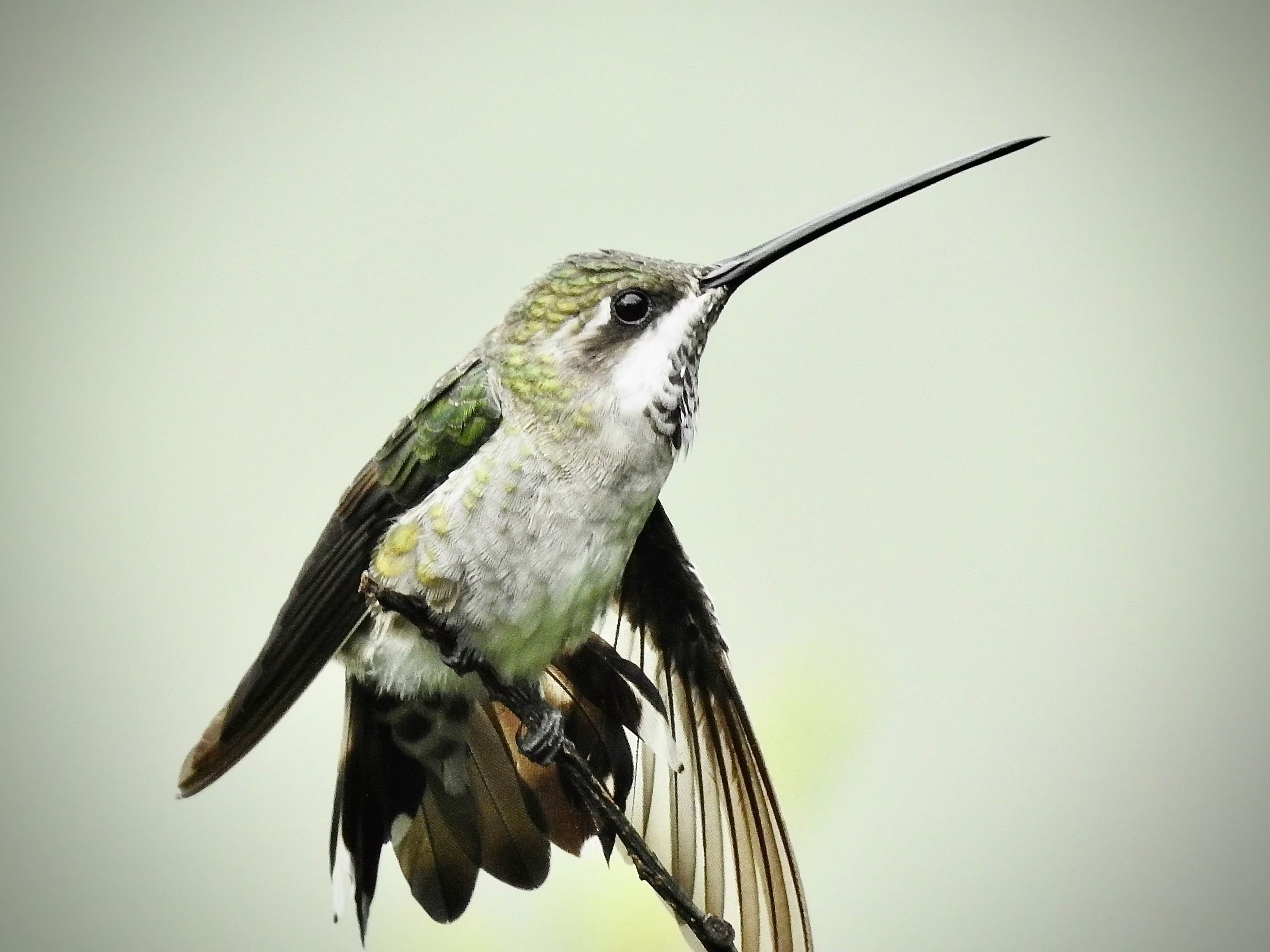
Hummingbirds
Hummingbirds are birds native to the Americas and comprise the biological family Trochilidae.
<div class="card card-img-overlay max-w-88">
  <img src="/images/5.avif" alt="Hummingbird" class="card-img-top" />
  <div class="card-body flex flex-col items-start">
    <h6 class="card-title">Hummingbirds</h6>
    <p class="mb-0">Hummingbirds are birds native to the Americas and comprise the biological family Trochilidae.</p>
    <button class="btn btn-sm btn-primary mt-auto">LEARN MORE</button>
  </div>
</div>
Card aside

Violetear
The violetears are hummingbirds of the genus Colibri.
Violetear
The violetears are hummingbirds of the genus Colibri.
<div class="card card-aside max-w-120">
  <div class="flex items-center justify-center">
    <img src="/images/3.avif" alt="Hummingbird" class='card-img-left w-48' />
  </div>
  <div class="card-body">
    <h6 class="card-title">Violetear</h6>
    <p class="mb-0">The violetears are hummingbirds of the genus Colibri.</p>
    <button class="btn btn-sm btn-primary mt-4">Continue</button>
  </div>
</div>

<div class="card card-aside max-w-120">
  <div class="card-body">
    <h6 class="card-title">Violetear</h6>
    <p class="mb-0">The violetears are hummingbirds of the genus Colibri.</p>
    <button class="btn btn-sm btn-primary mt-4">Continue</button>
  </div>
  <div class="flex items-center justify-center">
    <img src="/images/3.avif" alt="Hummingbird" class='card-img-right w-48' />
  </div>
</div>
Card group

Card Title
Some quick example text to build on the card title and make up the bulk of the card's content.
Card Title
Some quick example text to build on the card title and make up the bulk of the card's content.
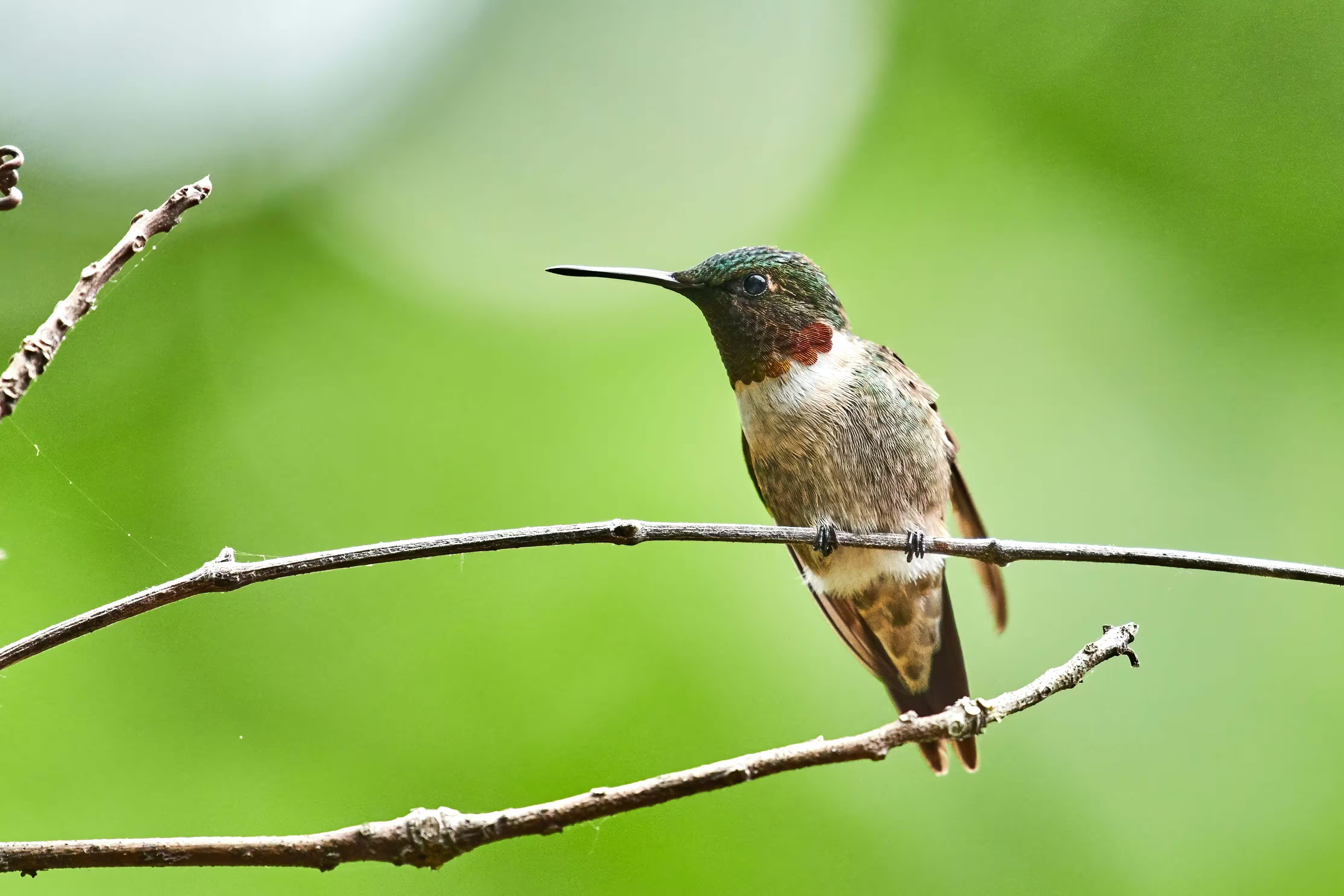
Card Title
Some quick example text to build on the card title and make up the bulk of the card's content.
<div class="card-group">
  <div class="card">
    <img src="/images/4.avif" alt="Hummingbird" class="card-img-top h-52" />
    <div class="card-body">
      <h6 class="card-title">Card Title</h6>
      <p class='mb-0'>Some quick example text to build on the card title and make up the bulk of the card's content.</p>
    </div>
    <div class="card-footer">
      <button class='btn btn-sm btn-subtle-primary'>Learn more</button>
    </div>
  </div>
  <div class="card">
    <img src="/images/5.avif" alt="Hummingbird" class="card-img-top h-52" />
    <div class="card-body">
      <h6 class="card-title">Card Title</h6>
      <p class='mb-0'>Some quick example text to build on the card title and make up the bulk of the card's content.</p>
    </div>
    <div class="card-footer">
      <button class='btn btn-sm btn-subtle-primary'>Learn more</button>
    </div>
  </div>
  <div class="card">
    <img src="/images/6.avif" alt="Hummingbird" class="card-img-top h-52" />
    <div class="card-body">
      <h6 class="card-title">Card Title</h6>
      <p class='mb-0'>Some quick example text to build on the card title and make up the bulk of the card's content.</p>
    </div>
    <div class="card-footer">
      <button class='btn btn-sm btn-subtle-primary'>Learn more</button>
    </div>
  </div>
</div>
Elevated Card
shadow-sm
Card Title
Some quick example text to build on the card title and make up the bulk of the card's content.
shadow-md
Card Title
Some quick example text to build on the card title and make up the bulk of the card's content.
shadow-lg
Card Title
Some quick example text to build on the card title and make up the bulk of the card's content.
shadow-xl
Card Title
Some quick example text to build on the card title and make up the bulk of the card's content.
<div class="card max-w-72 shadow-sm">
  <div class="card-header">
    <p class='mb-0'>shadow-sm</p>
  </div>
  <div class="card-body">
    <h6 class="card-title">Card Title</h6>
    <p class='mb-0'>Some quick example text to build on the card title and make up the bulk of the card's content.</p>
  </div>
  <div class="card-footer">
    <button class='btn btn-sm btn-subtle-primary'>Learn more</button>
  </div>
</div>

<div class="card max-w-72 shadow-md">
  <div class="card-header">
    <p class='mb-0'>shadow-md</p>
  </div>
  <div class="card-body">
    <h6 class="card-title">Card Title</h6>
    <p class='mb-0'>Some quick example text to build on the card title and make up the bulk of the card's content.</p>
  </div>
  <div class="card-footer">
    <button class='btn btn-sm btn-subtle-primary'>Learn more</button>
  </div>
</div>

<div class="card max-w-72 shadow-lg">
  <div class="card-header">
    <p class='mb-0'>shadow-lg</p>
  </div>
  <div class="card-body">
    <h6 class="card-title">Card Title</h6>
    <p class='mb-0'>Some quick example text to build on the card title and make up the bulk of the card's content.</p>
  </div>
  <div class="card-footer">
    <button class='btn btn-sm btn-subtle-primary'>Learn more</button>
  </div>
</div>

<div class="card max-w-72 shadow-xl">
  <div class="card-header">
    <p class='mb-0'>shadow-xl</p>
  </div>
  <div class="card-body">
    <h6 class="card-title">Card Title</h6>
    <p class='mb-0'>Some quick example text to build on the card title and make up the bulk of the card's content.</p>
  </div>
  <div class="card-footer">
    <button class='btn btn-sm btn-subtle-primary'>Learn more</button>
  </div>
</div>
Rounded borders
rounded-none
Card Title
Some quick example text to build on the card title and make up the bulk of the card's content.
rounded-md
Card Title
Some quick example text to build on the card title and make up the bulk of the card's content.
rounded-xl
Card Title
Some quick example text to build on the card title and make up the bulk of the card's content.
rounded-3xl
Card Title
Some quick example text to build on the card title and make up the bulk of the card's content.
<div class="card max-w-72 rounded-none">
  <div class="card-header">
    <p class='mb-0'>rounded-none</p>
  </div>
  <div class="card-body">
    <h6 class="card-title">Card Title</h6>
    <p class='mb-0'>Some quick example text to build on the card title and make up the bulk of the card's content.</p>
  </div>
  <div class="card-footer">
    <button class='btn btn-sm btn-subtle-primary'>Learn more</button>
  </div>
</div>

<div class="card max-w-72 rounded-md">
  <div class="card-header">
    <p class='mb-0'>rounded-md</p>
  </div>
  <div class="card-body">
    <h6 class="card-title">Card Title</h6>
    <p class='mb-0'>Some quick example text to build on the card title and make up the bulk of the card's content.</p>
  </div>
  <div class="card-footer">
    <button class='btn btn-sm btn-subtle-primary'>Learn more</button>
  </div>
</div>

<div class="card max-w-72 rounded-xl">
  <div class="card-header">
    <p class='mb-0'>rounded-xl</p>
  </div>
  <div class="card-body">
    <h6 class="card-title">Card Title</h6>
    <p class='mb-0'>Some quick example text to build on the card title and make up the bulk of the card's content.</p>
  </div>
  <div class="card-footer">
    <button class='btn btn-sm btn-subtle-primary'>Learn more</button>
  </div>
</div>

<div class="card max-w-72 rounded-3xl">
  <div class="card-header">
    <p class='mb-0'>rounded-3xl</p>
  </div>
  <div class="card-body">
    <h6 class="card-title">Card Title</h6>
    <p class='mb-0'>Some quick example text to build on the card title and make up the bulk of the card's content.</p>
  </div>
  <div class="card-footer">
    <button class='btn btn-sm btn-subtle-primary'>Learn more</button>
  </div>
</div>
Custom card
Oct 20, 2025
Boost your conversion rate
Optimize your funnel with data-driven strategies that increase engagement, build trust, and drive more meaningful conversions across every touchpoint. Deliver measurable impact through optimized user journeys, actionable insights, and conversion-focused execution.
<div class="card max-w-90 h-110 bg-[linear-gradient(rgba(0,0,0,0),rgba(0,0,0,0.9)),url('/images/7.avif')] bg-cover bg-center">
  <div class="card-body mt-auto grow-0">
    <p class="mb-2 text-gray-300">Oct 20, 2025</p>
    <h5 class="text-white">Boost your conversion rate</h5>
    <p class="text-gray-300 line-clamp-3">
      Optimize your funnel with data-driven strategies that increase engagement, build trust, and drive more meaningful conversions across every touchpoint. Deliver measurable impact through optimized user journeys, actionable insights, and conversion-focused execution.
    </p>
    <button class="btn btn-sm btn-primary">LEARN MORE</button>
  </div>
</div>
Accordion
DocsAccordions organize content into collapsible sections. They use the Collapse plugin to expand or hide content vertically, helping keep interfaces clean and structured.
Basic accordion
This is the first item’s accordion body It is shown by default, until the collapse plugin adds the appropriate classes that we use to style each element. These classes control the overall appearance, as well as the showing and hiding via CSS transitions. You can modify any of this with custom CSS or overriding our default variables. It’s also worth noting that just about any HTML can go within the .accordion-body, though the transition does limit overflow.
This is the second item’s accordion body It is hidden by default, until the collapse plugin adds the appropriate classes that we use to style each element. These classes control the overall appearance, as well as the showing and hiding via CSS transitions. You can modify any of this with custom CSS or overriding our default variables. It’s also worth noting that just about any HTML can go within the .accordion-body, though the transition does limit overflow.
This is the third item’s accordion body It is hidden by default, until the collapse plugin adds the appropriate classes that we use to style each element. These classes control the overall appearance, as well as the showing and hiding via CSS transitions. You can modify any of this with custom CSS or overriding our default variables. It’s also worth noting that just about any HTML can go within the .accordion-body, though the transition does limit overflow.
<div class="accordion" id="accordionExample">
  <div class="accordion-item">
    <h2 class="accordion-header">
      <button class="accordion-button" type="button" data-bs-toggle="collapse" data-bs-target="#collapseOne" aria-expanded="true" aria-controls="collapseOne">
        Accordion Item 1
      </button>
    </h2>
    <div id="collapseOne" class="accordion-collapse collapse show" data-bs-parent="#accordionExample">
      <div class="accordion-body">
        <p class="mb-0">This is the first item’s accordion body It is shown by default, until the collapse plugin adds the appropriate classes that we use to style each element. These classes control the overall appearance, as well as the showing and hiding via CSS transitions. You can modify any of this with custom CSS or overriding our default variables. It’s also worth noting that just about any HTML can go within the <code>.accordion-body</code>, though the transition does limit overflow.</p>
      </div>
    </div>
  </div>
  <div class="accordion-item">
    <h2 class="accordion-header">
      <button class="accordion-button collapsed" type="button" data-bs-toggle="collapse" data-bs-target="#collapseTwo" aria-expanded="false" aria-controls="collapseTwo">
        Accordion Item 2
      </button>
    </h2>
    <div id="collapseTwo" class="accordion-collapse collapse" data-bs-parent="#accordionExample">
      <div class="accordion-body">
        <p class="mb-0">This is the second item’s accordion body It is hidden by default, until the collapse plugin adds the appropriate classes that we use to style each element. These classes control the overall appearance, as well as the showing and hiding via CSS transitions. You can modify any of this with custom CSS or overriding our default variables. It’s also worth noting that just about any HTML can go within the <code>.accordion-body</code>, though the transition does limit overflow.</p>
      </div>
    </div>
  </div>
  <div class="accordion-item">
    <h2 class="accordion-header">
      <button class="accordion-button collapsed" type="button" data-bs-toggle="collapse" data-bs-target="#collapseThree" aria-expanded="false" aria-controls="collapseThree">
        Accordion Item 3
      </button>
    </h2>
    <div id="collapseThree" class="accordion-collapse collapse" data-bs-parent="#accordionExample">
      <div class="accordion-body">
        <p class="mb-0">This is the third item’s accordion body It is hidden by default, until the collapse plugin adds the appropriate classes that we use to style each element. These classes control the overall appearance, as well as the showing and hiding via CSS transitions. You can modify any of this with custom CSS or overriding our default variables. It’s also worth noting that just about any HTML can go within the <code>.accordion-body</code>, though the transition does limit overflow.</p>
      </div>
    </div>
  </div>
</div>
Always open
This is the first item’s accordion body It is shown by default, until the collapse plugin adds the appropriate classes that we use to style each element. These classes control the overall appearance, as well as the showing and hiding via CSS transitions. You can modify any of this with custom CSS or overriding our default variables. It’s also worth noting that just about any HTML can go within the .accordion-body, though the transition does limit overflow.
This is the second item’s accordion body It is hidden by default, until the collapse plugin adds the appropriate classes that we use to style each element. These classes control the overall appearance, as well as the showing and hiding via CSS transitions. You can modify any of this with custom CSS or overriding our default variables. It’s also worth noting that just about any HTML can go within the .accordion-body, though the transition does limit overflow.
This is the third item’s accordion body It is hidden by default, until the collapse plugin adds the appropriate classes that we use to style each element. These classes control the overall appearance, as well as the showing and hiding via CSS transitions. You can modify any of this with custom CSS or overriding our default variables. It’s also worth noting that just about any HTML can go within the .accordion-body, though the transition does limit overflow.
<div class="accordion" id="accordionAlwaysOpen">
  <div class="accordion-item">
    <h2 class="accordion-header">
      <button class="accordion-button" type="button" data-bs-toggle="collapse" data-bs-target="#collapseOneAlwaysOpen" aria-expanded="true" aria-controls="collapseOneAlwaysOpen">
        Accordion Item 1
      </button>
    </h2>
    <div id="collapseOneAlwaysOpen" class="accordion-collapse collapse show">
      <div class="accordion-body">
        <p class="mb-0">This is the first item’s accordion body It is shown by default, until the collapse plugin adds the appropriate classes that we use to style each element. These classes control the overall appearance, as well as the showing and hiding via CSS transitions. You can modify any of this with custom CSS or overriding our default variables. It’s also worth noting that just about any HTML can go within the <code>.accordion-body</code>, though the transition does limit overflow.</p>
      </div>
    </div>
  </div>
  <div class="accordion-item">
    <h2 class="accordion-header">
      <button class="accordion-button collapsed" type="button" data-bs-toggle="collapse" data-bs-target="#collapseTwoAlwaysOpen" aria-expanded="false" aria-controls="collapseTwoAlwaysOpen">
        Accordion Item 2
      </button>
    </h2>
    <div id="collapseTwoAlwaysOpen" class="accordion-collapse collapse">
      <div class="accordion-body">
        <p class="mb-0">This is the second item’s accordion body It is hidden by default, until the collapse plugin adds the appropriate classes that we use to style each element. These classes control the overall appearance, as well as the showing and hiding via CSS transitions. You can modify any of this with custom CSS or overriding our default variables. It’s also worth noting that just about any HTML can go within the <code>.accordion-body</code>, though the transition does limit overflow.</p>
      </div>
    </div>
  </div>
  <div class="accordion-item">
    <h2 class="accordion-header">
      <button class="accordion-button collapsed" type="button" data-bs-toggle="collapse" data-bs-target="#collapseThreeAlwaysOpen" aria-expanded="false" aria-controls="collapseThreeAlwaysOpen">
        Accordion Item 3
      </button>
    </h2>
    <div id="collapseThreeAlwaysOpen" class="accordion-collapse collapse">
      <div class="accordion-body">
        <p class="mb-0">This is the third item’s accordion body It is hidden by default, until the collapse plugin adds the appropriate classes that we use to style each element. These classes control the overall appearance, as well as the showing and hiding via CSS transitions. You can modify any of this with custom CSS or overriding our default variables. It’s also worth noting that just about any HTML can go within the <code>.accordion-body</code>, though the transition does limit overflow.</p>
      </div>
    </div>
  </div>
</div>
Collapse
DocsThe Collapse component toggles content visibility with simple classes and JavaScript, allowing smooth expand and collapse animations.
Example
<div class="inline-flex gap-2 mb-3">
  <a class="btn btn-primary" data-bs-toggle="collapse" href="#collapseExample-2" role="button" aria-expanded="false" aria-controls="collapseExample-2">Link with href</a>
  <button class="btn btn-primary" type="button" data-bs-toggle="collapse" data-bs-target="#collapseExample-2" aria-expanded="false" aria-controls="collapseExample-2">Button with data-bs-target</button>
</div>
<div class="collapse" id="collapseExample-2">
  <div class="card card-body">
    Some placeholder content for the collapse component. This panel is hidden by default but revealed when the user activates the relevant trigger.
  </div>
</div>
Horizontal
<div class='mb-3'>
  <button class="btn btn-primary" type="button" data-bs-toggle="collapse" data-bs-target="#collapseWidthExample" aria-expanded="false" aria-controls="collapseWidthExample">Toggle width collapse</button>
</div>
<div class='min-h-30'>
  <div class="collapse collapse-horizontal" id="collapseWidthExample">
    <div class="card card-body w-75">
      This is some placeholder content for a horizontal collapse. It’s hidden by default and shown when triggered.
    </div>
  </div>
</div>
Multiple toggles and targets
<div class="inline-flex gap-1 mb-3">
  <a class="btn btn-primary" data-bs-toggle="collapse" href="#multiCollapseExample1" role="button" aria-expanded="false" aria-controls="multiCollapseExample1">Toggle first element</a>
  <button class="btn btn-primary" type="button" data-bs-toggle="collapse" data-bs-target="#multiCollapseExample2" aria-expanded="false" aria-controls="multiCollapseExample2">Toggle second element</button>
  <button class="btn btn-primary" type="button" data-bs-toggle="collapse" data-bs-target=".multi-collapse" aria-expanded="false" aria-controls="multiCollapseExample1 multiCollapseExample2">Toggle both elements</button>
</div>
<div class="grid grid-cols-2 gap-3">
  <div>
    <div class="collapse multi-collapse" id="multiCollapseExample1">
      <div class="card card-body">
        Some placeholder content for first collapse component of this multi-collapse example. This panel is hidden by default but revealed when the user activates the relevant trigger.
      </div>
    </div>
  </div>
  <div>
    <div class="collapse multi-collapse" id="multiCollapseExample2">
      <div class="card card-body">
        Some placeholder content for second collapse component of this multi-collapse example. This panel is hidden by default but revealed when the user activates the relevant trigger.
      </div>
    </div>
  </div>
</div>
Carousel
DocsThe Carousel cycles through images or content with smooth transitions. It supports auto-play, swipe gestures, controls, and indicators, and is fully customizable.
Basic examples
<div id="carouselExample" class="carousel slide">
  <div class="carousel-inner">
    <div class="carousel-item active">
      <div class="bg-emphasis/80 h-100 flex items-center justify-center text-4xl text-muted">Slide One</div>
    </div>
    <div class="carousel-item">
      <div class="bg-emphasis/90 h-100 flex items-center justify-center text-4xl text-muted">Slide Two</div>
    </div>
    <div class="carousel-item">
      <div class="bg-emphasis/70 h-100 flex items-center justify-center text-4xl text-muted">Slide Three</div>
    </div>
  </div>
  <button class="carousel-control-prev" type="button" data-bs-target="#carouselExample" data-bs-slide="prev">
    <span class="carousel-control-prev-icon" aria-hidden="true"></span>
    <span class="hidden">Previous</span>
  </button>
  <button class="carousel-control-next" type="button" data-bs-target="#carouselExample" data-bs-slide="next">
    <span class="carousel-control-next-icon" aria-hidden="true"></span>
    <span class="hidden">Next</span>
  </button>
</div>
Indicators
<div id="carouselExampleIndicators" class="carousel slide">
  <div class="carousel-indicators">
    <button type="button" data-bs-target="#carouselExampleIndicators" data-bs-slide-to="0" class="active" aria-current="true" aria-label="Slide 1"></button>
    <button type="button" data-bs-target="#carouselExampleIndicators" data-bs-slide-to="1" aria-label="Slide 2"></button>
    <button type="button" data-bs-target="#carouselExampleIndicators" data-bs-slide-to="2" aria-label="Slide 3"></button>
  </div>
  <div class="carousel-inner">
    <div class="carousel-item active">
      <div class="bg-emphasis/80 h-100 flex items-center justify-center text-4xl text-muted">Slide One</div>
    </div>
    <div class="carousel-item">
      <div class="bg-emphasis/90 h-100 flex items-center justify-center text-4xl text-muted">Slide Two</div>
    </div>
    <div class="carousel-item">
      <div class="bg-emphasis/70 h-100 flex items-center justify-center text-4xl text-muted">Slide Three</div>
    </div>
  </div>
  <button class="carousel-control-prev" type="button" data-bs-target="#carouselExampleIndicators" data-bs-slide="prev">
    <span class="carousel-control-prev-icon" aria-hidden="true"></span>
    <span class="hidden">Previous</span>
  </button>
  <button class="carousel-control-next" type="button" data-bs-target="#carouselExampleIndicators" data-bs-slide="next">
    <span class="carousel-control-next-icon" aria-hidden="true"></span>
    <span class="hidden">Next</span>
  </button>
</div>
Captions
<div id="carouselExampleCaptions" class="carousel slide">
  <div class="carousel-indicators">
    <button type="button" data-bs-target="#carouselExampleCaptions" data-bs-slide-to="0" class="active" aria-current="true" aria-label="Slide 1"></button>
    <button type="button" data-bs-target="#carouselExampleCaptions" data-bs-slide-to="1" aria-label="Slide 2"></button>
    <button type="button" data-bs-target="#carouselExampleCaptions" data-bs-slide-to="2" aria-label="Slide 3"></button>
  </div>
  <div class="carousel-inner">
    <div class="carousel-item active">
      <div class="bg-emphasis/80 h-100 flex items-center justify-center text-4xl text-muted">Slide One</div>
      <div class="carousel-caption hidden md:block">
        <h5 class="text-lg font-semibold mb-0">First slide label</h5>
        <p class="mb-0">Some representative placeholder content for the first slide.</p>
      </div>
    </div>
    <div class="carousel-item">
      <div class="bg-emphasis/90 h-100 flex items-center justify-center text-4xl text-muted">Slide Two</div>
      <div class="carousel-caption hidden md:block">
        <h5 class="text-lg font-semibold mb-0">Second slide label</h5>
        <p class="mb-0">Some representative placeholder content for the second slide.</p>
      </div>
    </div>
    <div class="carousel-item">
      <div class="bg-emphasis/70 h-100 flex items-center justify-center text-4xl text-muted">Slide Three</div>
      <div class="carousel-caption hidden md:block">
        <h5 class="text-lg font-semibold mb-0">Third slide label</h5>
        <p class="mb-0">Some representative placeholder content for the third slide.</p>
      </div>
    </div>
  </div>
  <button class="carousel-control-prev" type="button" data-bs-target="#carouselExampleCaptions" data-bs-slide="prev">
    <span class="carousel-control-prev-icon" aria-hidden="true"></span>
    <span class="hidden">Previous</span>
  </button>
  <button class="carousel-control-next" type="button" data-bs-target="#carouselExampleCaptions" data-bs-slide="next">
    <span class="carousel-control-next-icon" aria-hidden="true"></span>
    <span class="hidden">Next</span>
  </button>
</div>
Crossfade
<div id="carouselExampleFade" class="carousel slide carousel-fade">
  <div class="carousel-inner">
    <div class="carousel-item active">
      <div class="bg-emphasis/80 h-100 flex items-center justify-center text-4xl text-muted">Slide One</div>
    </div>
    <div class="carousel-item">
      <div class="bg-emphasis/90 h-100 flex items-center justify-center text-4xl text-muted">Slide Two</div>
    </div>
    <div class="carousel-item">
      <div class="bg-emphasis/70 h-100 flex items-center justify-center text-4xl text-muted">Slide Three</div>
    </div>
  </div>
  <button class="carousel-control-prev" type="button" data-bs-target="#carouselExampleFade" data-bs-slide="prev">
    <span class="carousel-control-prev-icon" aria-hidden="true"></span>
    <span class="hidden">Previous</span>
  </button>
  <button class="carousel-control-next" type="button" data-bs-target="#carouselExampleFade" data-bs-slide="next">
    <span class="carousel-control-next-icon" aria-hidden="true"></span>
    <span class="hidden">Next</span>
  </button>
</div>
Autoplaying carousels
<div id="carouselExampleAutoplaying" class="carousel slide" data-bs-ride="carousel">
  <div class="carousel-inner">
    <div class="carousel-item active">
      <div class="bg-emphasis/80 h-100 flex items-center justify-center text-4xl text-muted">Slide One</div>
    </div>
    <div class="carousel-item">
      <div class="bg-emphasis/90 h-100 flex items-center justify-center text-4xl text-muted">Slide Two</div>
    </div>
    <div class="carousel-item">
      <div class="bg-emphasis/70 h-100 flex items-center justify-center text-4xl text-muted">Slide Three</div>
    </div>
  </div>
  <button class="carousel-control-prev" type="button" data-bs-target="#carouselExampleAutoplaying" data-bs-slide="prev">
    <span class="carousel-control-prev-icon" aria-hidden="true"></span>
    <span class="hidden">Previous</span>
  </button>
  <button class="carousel-control-next" type="button" data-bs-target="#carouselExampleAutoplaying" data-bs-slide="next">
    <span class="carousel-control-next-icon" aria-hidden="true"></span>
    <span class="hidden">Next</span>
  </button>
</div><div id="carouselExampleRide" class="carousel slide" data-bs-ride="true">
<div class="carousel-inner">
<div class="carousel-item active">
<div class="bg-emphasis/80 h-100 flex items-center justify-center text-4xl text-muted">Slide One</div>
</div>
<div class="carousel-item">
<div class="bg-emphasis/90 h-100 flex items-center justify-center text-4xl text-muted">Slide Two</div>
</div>
<div class="carousel-item">
<div class="bg-emphasis/70 h-100 flex items-center justify-center text-4xl text-muted">Slide Three</div>
</div>
</div>
<button class="carousel-control-prev" type="button" data-bs-target="#carouselExampleRide" data-bs-slide="prev">
<span class="carousel-control-prev-icon" aria-hidden="true"></span>
<span class="hidden">Previous</span>
</button>
<button class="carousel-control-next" type="button" data-bs-target="#carouselExampleRide" data-bs-slide="next">
<span class="carousel-control-next-icon" aria-hidden="true"></span>
<span class="hidden">Next</span>
</button>
</div>Individual interval
<div id="carouselExampleInterval" class="carousel slide" data-bs-ride="carousel">
  <div class="carousel-inner">
    <div class="carousel-item active" data-bs-interval="10000">
      <div class="bg-emphasis/80 h-100 flex items-center justify-center text-4xl text-muted">Slide One</div>
    </div>
    <div class="carousel-item" data-bs-interval="2000">
      <div class="bg-emphasis/90 h-100 flex items-center justify-center text-4xl text-muted">Slide Two</div>
    </div>
    <div class="carousel-item">
      <div class="bg-emphasis/70 h-100 flex items-center justify-center text-4xl text-muted">Slide Three</div>
    </div>
  </div>
  <button class="carousel-control-prev" type="button" data-bs-target="#carouselExampleInterval" data-bs-slide="prev">
    <span class="carousel-control-prev-icon" aria-hidden="true"></span>
    <span class="hidden">Previous</span>
  </button>
  <button class="carousel-control-next" type="button" data-bs-target="#carouselExampleInterval" data-bs-slide="next">
    <span class="carousel-control-next-icon" aria-hidden="true"></span>
    <span class="hidden">Next</span>
  </button>
</div>
Autoplaying carousels without controls
<div id="carouselExampleSlidesOnly" class="carousel slide" data-bs-ride="carousel">
  <div class="carousel-inner">
    <div class="carousel-item active">
      <div class="bg-emphasis/80 h-100 flex items-center justify-center text-4xl text-muted">Slide One</div>
    </div>
    <div class="carousel-item">
      <div class="bg-emphasis/90 h-100 flex items-center justify-center text-4xl text-muted">Slide Two</div>
    </div>
    <div class="carousel-item">
      <div class="bg-emphasis/70 h-100 flex items-center justify-center text-4xl text-muted">Slide Three</div>
    </div>
  </div>
</div>
Disable touch swiping
<div id="carouselExampleControlsNoTouching" class="carousel slide" data-bs-touch="false">
  <div class="carousel-inner">
    <div class="carousel-item active">
      <div class="bg-emphasis/80 h-100 flex items-center justify-center text-4xl text-muted">Slide One</div>
    </div>
    <div class="carousel-item">
      <div class="bg-emphasis/90 h-100 flex items-center justify-center text-4xl text-muted">Slide Two</div>
    </div>
    <div class="carousel-item">
      <div class="bg-emphasis/70 h-100 flex items-center justify-center text-4xl text-muted">Slide Three</div>
    </div>
  </div>
  <button class="carousel-control-prev" type="button" data-bs-target="#carouselExampleControlsNoTouching" data-bs-slide="prev">
    <span class="carousel-control-prev-icon" aria-hidden="true"></span>
    <span class="hidden">Previous</span>
  </button>
  <button class="carousel-control-next" type="button" data-bs-target="#carouselExampleControlsNoTouching" data-bs-slide="next">
    <span class="carousel-control-next-icon" aria-hidden="true"></span>
    <span class="hidden">Next</span>
  </button>
</div>
Custom next, previous icon
<div id="customNextPrevIconExample" class="carousel slide">
  <div class="carousel-inner">
    <div class="carousel-item active">
      <div class="bg-emphasis/80 h-100 flex items-center justify-center text-4xl text-muted">Slide One</div>
    </div>
    <div class="carousel-item">
      <div class="bg-emphasis/90 h-100 flex items-center justify-center text-4xl text-muted">Slide Two</div>
    </div>
    <div class="carousel-item">
      <div class="bg-emphasis/70 h-100 flex items-center justify-center text-4xl text-muted">Slide Three</div>
    </div>
  </div>
  <button class="carousel-control-prev" type="button" data-bs-target="#customNextPrevIconExample" data-bs-slide="prev">
    <svg class="text-primary" xmlns="http://www.w3.org/2000/svg" width="36" height="36" viewBox="0 0 24 24"><path fill="currentColor" d="m7.85 13l2.85 2.85q.3.3.288.7t-.288.7q-.3.3-.712.313t-.713-.288L4.7 12.7q-.3-.3-.3-.7t.3-.7l4.575-4.575q.3-.3.713-.287t.712.312q.275.3.288.7t-.288.7L7.85 11H19q.425 0 .713.288T20 12t-.288.713T19 13z"/></svg>
  </button>
  <button class="carousel-control-next" type="button" data-bs-target="#customNextPrevIconExample" data-bs-slide="next">
    <svg class="text-primary" xmlns="http://www.w3.org/2000/svg" width="36" height="36" viewBox="0 0 24 24"><path fill="currentColor" d="M16.15 13H5q-.425 0-.712-.288T4 12t.288-.712T5 11h11.15L13.3 8.15q-.3-.3-.288-.7t.288-.7q.3-.3.713-.312t.712.287L19.3 11.3q.15.15.213.325t.062.375t-.062.375t-.213.325l-4.575 4.575q-.3.3-.712.288t-.713-.313q-.275-.3-.288-.7t.288-.7z"/></svg>
  </button>
</div>
Tables
DocsTables organize and display structured data in rows and columns.
Basic table
| ID | Name | Status | |
|---|---|---|---|
| 001 | Alice Johnson | alice.johnson@example.com | Active |
| 002 | Bob Smith | bob.smith@example.com | Inactive |
| 003 | Charlie Davis | charlie.davis@example.com | Pending |
| 004 | Diana Lee | diana.lee@example.com | Active |
| 005 | Ethan Brown | ethan.brown@example.com | Suspended |
<div class="overflow-x-auto">
  <table class="table">
    <thead>
      <tr>
        <th scope="col">ID</th>
        <th scope="col">Name</th>
        <th scope="col">Email</th>
        <th scope="col">Status</th>
      </tr>
    </thead>
    <tbody>
      <tr>
        <th scope="row">001</th>
        <td>Alice Johnson</td>
        <td><a href="#" class="link link-hover link-primary">alice.johnson@example.com</a></td>
        <td>Active</td>
      </tr>
      <tr>
        <th scope="row">002</th>
        <td>Bob Smith</td>
        <td><a href="#" class="link link-hover link-primary">bob.smith@example.com</a></td>
        <td>Inactive</td>
      </tr>
      <tr>
        <th scope="row">003</th>
        <td>Charlie Davis</td>
        <td><a href="#" class="link link-hover link-primary">charlie.davis@example.com</a></td>
        <td>Pending</td>
      </tr>
      <tr>
        <th scope="row">004</th>
        <td>Diana Lee</td>
        <td><a href="#" class="link link-hover link-primary">diana.lee@example.com</a></td>
        <td>Active</td>
      </tr>
      <tr>
        <th scope="row">005</th>
        <td>Ethan Brown</td>
        <td><a href="#" class="link link-hover link-primary">ethan.brown@example.com</a></td>
        <td>Suspended</td>
      </tr>
    </tbody>
  </table>
</div>
Highlight table
| ID | Name | Status | |
|---|---|---|---|
| 001 | Alice Johnson | alice.johnson@example.com | Active |
| 002 | Bob Smith | bob.smith@example.com | Inactive |
| 003 | Charlie Davis | charlie.davis@example.com | Pending |
| 004 | Diana Lee | diana.lee@example.com | Active |
| 005 | Ethan Brown | ethan.brown@example.com | Suspended |
|
Total count: 5 |
<div class="overflow-x-auto rounded-2xl">
  <table class="table table-highlight">
    <thead>
      <tr>
        <th scope="col">ID</th>
        <th scope="col">Name</th>
        <th scope="col">Email</th>
        <th scope="col">Status</th>
      </tr>
    </thead>
    <tbody>
      <tr>
        <th scope="row">001</th>
        <td>Alice Johnson</td>
        <td><a href="#" class="link link-hover link-primary">alice.johnson@example.com</a></td>
        <td>Active</td>
      </tr>
      <tr>
        <th scope="row">002</th>
        <td>Bob Smith</td>
        <td><a href="#" class="link link-hover link-primary">bob.smith@example.com</a></td>
        <td>Inactive</td>
      </tr>
      <tr>
        <th scope="row">003</th>
        <td>Charlie Davis</td>
        <td><a href="#" class="link link-hover link-primary">charlie.davis@example.com</a></td>
        <td>Pending</td>
      </tr>
      <tr>
        <th scope="row">004</th>
        <td>Diana Lee</td>
        <td><a href="#" class="link link-hover link-primary">diana.lee@example.com</a></td>
        <td>Active</td>
      </tr>
      <tr>
        <th scope="row">005</th>
        <td>Ethan Brown</td>
        <td><a href="#" class="link link-hover link-primary">ethan.brown@example.com</a></td>
        <td>Suspended</td>
      </tr>
    </tbody>
    <tfoot>
      <tr>
        <th scope="row"></th>
        <td></td>
        <td>
          <p class="font-semibold mb-0">Total count: 5</p>
        </td>
        <td></td>
      </tr>
    </tfoot>
  </table>
</div>
Variants
| ID | Name | Status | |
|---|---|---|---|
| 001 | Alice Johnson | alice.johnson@example.com | Active |
| 002 | Bob Smith | bob.smith@example.com | Inactive |
| 003 | Charlie Davis | charlie.davis@example.com | Pending |
| 004 | Diana Lee | diana.lee@example.com | Active |
| 005 | Ethan Brown | ethan.brown@example.com | Suspended |
| 006 | Fiona Green | fiona.green@example.com | Active |
| 007 | George Hill | george.hill@example.com | Inactive |
<div class="overflow-x-auto">
  <table class="table">
    <thead>
      <tr>
        <th scope="col">ID</th>
        <th scope="col">Name</th>
        <th scope="col">Email</th>
        <th scope="col">Status</th>
      </tr>
    </thead>
    <tbody>
      <tr class="table-primary">
        <th scope="row">001</th>
        <td>Alice Johnson</td>
        <td><a href="#" class="link link-hover link-primary">alice.johnson@example.com</a></td>
        <td>Active</td>
      </tr>
      <tr class="table-secondary">
        <th scope="row">002</th>
        <td>Bob Smith</td>
        <td><a href="#" class="link link-hover link-primary">bob.smith@example.com</a></td>
        <td>Inactive</td>
      </tr>
      <tr class="table-info">
        <th scope="row">003</th>
        <td>Charlie Davis</td>
        <td><a href="#" class="link link-hover link-primary">charlie.davis@example.com</a></td>
        <td>Pending</td>
      </tr>
      <tr class="table-success">
        <th scope="row">004</th>
        <td>Diana Lee</td>
        <td><a href="#" class="link link-hover link-primary">diana.lee@example.com</a></td>
        <td>Active</td>
      </tr>
      <tr class="table-warning">
        <th scope="row">005</th>
        <td>Ethan Brown</td>
        <td><a href="#" class="link link-hover link-primary">ethan.brown@example.com</a></td>
        <td>Suspended</td>
      </tr>
      <tr class="table-danger">
        <th scope="row">006</th>
        <td>Fiona Green</td>
        <td><a href="#" class="link link-hover link-primary">fiona.green@example.com</a></td>
        <td>Active</td>
      </tr>
      <tr class="table-neutral">
        <th scope="row">007</th>
        <td>George Hill</td>
        <td><a href="#" class="link link-hover link-primary">george.hill@example.com</a></td>
        <td>Inactive</td>
      </tr>
    </tbody>
  </table>
</div>
Small table
| ID | Name | Status | |
|---|---|---|---|
| 001 | Alice Johnson | alice.johnson@example.com | Active |
| 002 | Bob Smith | bob.smith@example.com | Inactive |
| 003 | Charlie Davis | charlie.davis@example.com | Pending |
| 004 | Diana Lee | diana.lee@example.com | Active |
| 005 | Ethan Brown | ethan.brown@example.com | Suspended |
<div class="overflow-x-auto">
  <table class="table table-sm">
    <thead>
      <tr>
        <th scope="col">ID</th>
        <th scope="col">Name</th>
        <th scope="col">Email</th>
        <th scope="col">Status</th>
      </tr>
    </thead>
    <tbody>
      <tr>
        <th scope="row">001</th>
        <td>Alice Johnson</td>
        <td><a href="#" class="link link-hover link-primary">alice.johnson@example.com</a></td>
        <td>Active</td>
      </tr>
      <tr>
        <th scope="row">002</th>
        <td>Bob Smith</td>
        <td><a href="#" class="link link-hover link-primary">bob.smith@example.com</a></td>
        <td>Inactive</td>
      </tr>
      <tr>
        <th scope="row">003</th>
        <td>Charlie Davis</td>
        <td><a href="#" class="link link-hover link-primary">charlie.davis@example.com</a></td>
        <td>Pending</td>
      </tr>
      <tr>
        <th scope="row">004</th>
        <td>Diana Lee</td>
        <td><a href="#" class="link link-hover link-primary">diana.lee@example.com</a></td>
        <td>Active</td>
      </tr>
      <tr>
        <th scope="row">005</th>
        <td>Ethan Brown</td>
        <td><a href="#" class="link link-hover link-primary">ethan.brown@example.com</a></td>
        <td>Suspended</td>
      </tr>
    </tbody>
  </table>
</div>
Striped table
| ID | Name | Status | |
|---|---|---|---|
| 001 | Alice Johnson | alice.johnson@example.com | Active |
| 002 | Bob Smith | bob.smith@example.com | Inactive |
| 003 | Charlie Davis | charlie.davis@example.com | Pending |
| 004 | Diana Lee | diana.lee@example.com | Active |
| 005 | Ethan Brown | ethan.brown@example.com | Suspended |
<div class="overflow-x-auto">
  <table class="table table-striped">
    <thead>
      <tr>
        <th scope="col">ID</th>
        <th scope="col">Name</th>
        <th scope="col">Email</th>
        <th scope="col">Status</th>
      </tr>
    </thead>
    <tbody>
      <tr>
        <th scope="row">001</th>
        <td>Alice Johnson</td>
        <td><a href="#" class="link link-hover link-primary">alice.johnson@example.com</a></td>
        <td>Active</td>
      </tr>
      <tr>
        <th scope="row">002</th>
        <td>Bob Smith</td>
        <td><a href="#" class="link link-hover link-primary">bob.smith@example.com</a></td>
        <td>Inactive</td>
      </tr>
      <tr>
        <th scope="row">003</th>
        <td>Charlie Davis</td>
        <td><a href="#" class="link link-hover link-primary">charlie.davis@example.com</a></td>
        <td>Pending</td>
      </tr>
      <tr>
        <th scope="row">004</th>
        <td>Diana Lee</td>
        <td><a href="#" class="link link-hover link-primary">diana.lee@example.com</a></td>
        <td>Active</td>
      </tr>
      <tr>
        <th scope="row">005</th>
        <td>Ethan Brown</td>
        <td><a href="#" class="link link-hover link-primary">ethan.brown@example.com</a></td>
        <td>Suspended</td>
      </tr>
    </tbody>
  </table>
</div>
Striped columns
| ID | Name | Status | |
|---|---|---|---|
| 001 | Alice Johnson | alice.johnson@example.com | Active |
| 002 | Bob Smith | bob.smith@example.com | Inactive |
| 003 | Charlie Davis | charlie.davis@example.com | Pending |
| 004 | Diana Lee | diana.lee@example.com | Active |
| 005 | Ethan Brown | ethan.brown@example.com | Suspended |
<div class="overflow-x-auto">
  <table class="table table-striped-columns">
    <thead>
      <tr>
        <th scope="col">ID</th>
        <th scope="col">Name</th>
        <th scope="col">Email</th>
        <th scope="col">Status</th>
      </tr>
    </thead>
    <tbody>
      <tr>
        <th scope="row">001</th>
        <td>Alice Johnson</td>
        <td><a href="#" class="link link-hover link-primary">alice.johnson@example.com</a></td>
        <td>Active</td>
      </tr>
      <tr>
        <th scope="row">002</th>
        <td>Bob Smith</td>
        <td><a href="#" class="link link-hover link-primary">bob.smith@example.com</a></td>
        <td>Inactive</td>
      </tr>
      <tr>
        <th scope="row">003</th>
        <td>Charlie Davis</td>
        <td><a href="#" class="link link-hover link-primary">charlie.davis@example.com</a></td>
        <td>Pending</td>
      </tr>
      <tr>
        <th scope="row">004</th>
        <td>Diana Lee</td>
        <td><a href="#" class="link link-hover link-primary">diana.lee@example.com</a></td>
        <td>Active</td>
      </tr>
      <tr>
        <th scope="row">005</th>
        <td>Ethan Brown</td>
        <td><a href="#" class="link link-hover link-primary">ethan.brown@example.com</a></td>
        <td>Suspended</td>
      </tr>
    </tbody>
  </table>
</div>
Hoverable table
| ID | Name | Status | |
|---|---|---|---|
| 001 | Alice Johnson | alice.johnson@example.com | Active |
| 002 | Bob Smith | bob.smith@example.com | Inactive |
| 003 | Charlie Davis | charlie.davis@example.com | Pending |
| 004 | Diana Lee | diana.lee@example.com | Active |
| 005 | Ethan Brown | ethan.brown@example.com | Suspended |
<div class="overflow-x-auto rounded-t-2xl">
  <table class="table table-highlight table-hover">
    <thead>
      <tr>
        <th scope="col">ID</th>
        <th scope="col">Name</th>
        <th scope="col">Email</th>
        <th scope="col">Status</th>
      </tr>
    </thead>
    <tbody>
      <tr>
        <th scope="row">001</th>
        <td>Alice Johnson</td>
        <td><a href="#" class="link link-hover link-primary">alice.johnson@example.com</a></td>
        <td>Active</td>
      </tr>
      <tr>
        <th scope="row">002</th>
        <td>Bob Smith</td>
        <td><a href="#" class="link link-hover link-primary">bob.smith@example.com</a></td>
        <td>Inactive</td>
      </tr>
      <tr>
        <th scope="row">003</th>
        <td>Charlie Davis</td>
        <td><a href="#" class="link link-hover link-primary">charlie.davis@example.com</a></td>
        <td>Pending</td>
      </tr>
      <tr>
        <th scope="row">004</th>
        <td>Diana Lee</td>
        <td><a href="#" class="link link-hover link-primary">diana.lee@example.com</a></td>
        <td>Active</td>
      </tr>
      <tr>
        <th scope="row">005</th>
        <td>Ethan Brown</td>
        <td><a href="#" class="link link-hover link-primary">ethan.brown@example.com</a></td>
        <td>Suspended</td>
      </tr>
    </tbody>
  </table>
</div>
Active table
| ID | Name | Status | |
|---|---|---|---|
| 001 | Alice Johnson | alice.johnson@example.com | Active |
| 002 | Bob Smith | bob.smith@example.com | Inactive |
| 003 | Charlie Davis | charlie.davis@example.com | Pending |
| 004 | Diana Lee | diana.lee@example.com | Active |
| 005 | Ethan Brown | ethan.brown@example.com | Suspended |
<div class="overflow-x-auto">
  <table class="table">
    <thead>
      <tr>
        <th scope="col">ID</th>
        <th scope="col">Name</th>
        <th scope="col">Email</th>
        <th scope="col">Status</th>
      </tr>
    </thead>
    <tbody>
      <tr>
        <th scope="row">001</th>
        <td>Alice Johnson</td>
        <td><a href="#" class="link link-hover link-primary">alice.johnson@example.com</a></td>
        <td>Active</td>
      </tr>
      <tr class="table-active">
        <th scope="row">002</th>
        <td>Bob Smith</td>
        <td><a href="#" class="link link-hover link-primary">bob.smith@example.com</a></td>
        <td>Inactive</td>
      </tr>
      <tr>
        <th scope="row">003</th>
        <td>Charlie Davis</td>
        <td><a href="#" class="link link-hover link-primary">charlie.davis@example.com</a></td>
        <td>Pending</td>
      </tr>
      <tr>
        <th scope="row">004</th>
        <td>Diana Lee</td>
        <td class="table-active"><a href="#" class="link link-hover link-primary">diana.lee@example.com</a></td>
        <td>Active</td>
      </tr>
      <tr>
        <th scope="row">005</th>
        <td>Ethan Brown</td>
        <td><a href="#" class="link link-hover link-primary">ethan.brown@example.com</a></td>
        <td>Suspended</td>
      </tr>
    </tbody>
  </table>
</div>
Table sticky header
| ID | Name | Status | |
|---|---|---|---|
| 001 | Alice Johnson | alice.johnson@example.com | Active |
| 002 | Bob Smith | bob.smith@example.com | Inactive |
| 003 | Charlie Davis | charlie.davis@example.com | Pending |
| 004 | Diana Lee | diana.lee@example.com | Active |
| 005 | Ethan Brown | ethan.brown@example.com | Suspended |
| 006 | Fiona Green | fiona.green@example.com | Active |
| 007 | George Hill | george.hill@example.com | Inactive |
| 008 | Hannah Moore | hannah.moore@example.com | Active |
| 009 | Ian Thompson | ian.thompson@example.com | Pending |
| 010 | Julia White | julia.white@example.com | Active |
<div class="overflow-auto rounded-t-2xl h-76">
  <table class="table table-highlight table-sticky-header">
    <thead>
      <tr>
        <th scope="col">ID</th>
        <th scope="col">Name</th>
        <th scope="col">Email</th>
        <th scope="col">Status</th>
      </tr>
    </thead>
    <tbody>
      <tr>
        <th scope="row">001</th>
        <td>Alice Johnson</td>
        <td><a href="#" class="link link-hover link-primary">alice.johnson@example.com</a></td>
        <td>Active</td>
      </tr>
      <tr>
        <th scope="row">002</th>
        <td>Bob Smith</td>
        <td><a href="#" class="link link-hover link-primary">bob.smith@example.com</a></td>
        <td>Inactive</td>
      </tr>
      <tr>
        <th scope="row">003</th>
        <td>Charlie Davis</td>
        <td><a href="#" class="link link-hover link-primary">charlie.davis@example.com</a></td>
        <td>Pending</td>
      </tr>
      <tr>
        <th scope="row">004</th>
        <td>Diana Lee</td>
        <td><a href="#" class="link link-hover link-primary">diana.lee@example.com</a></td>
        <td>Active</td>
      </tr>
      <tr>
        <th scope="row">005</th>
        <td>Ethan Brown</td>
        <td><a href="#" class="link link-hover link-primary">ethan.brown@example.com</a></td>
        <td>Suspended</td>
      </tr>
      <tr>
        <th scope="row">006</th>
        <td>Fiona Green</td>
        <td><a href="#" class="link link-hover link-primary">fiona.green@example.com</a></td>
        <td>Active</td>
      </tr>
      <tr>
        <th scope="row">007</th>
        <td>George Hill</td>
        <td><a href="#" class="link link-hover link-primary">george.hill@example.com</a></td>
        <td>Inactive</td>
      </tr>
      <tr>
        <th scope="row">008</th>
        <td>Hannah Moore</td>
        <td><a href="#" class="link link-hover link-primary">hannah.moore@example.com</a></td>
        <td>Active</td>
      </tr>
      <tr>
        <th scope="row">009</th>
        <td>Ian Thompson</td>
        <td><a href="#" class="link link-hover link-primary">ian.thompson@example.com</a></td>
        <td>Pending</td>
      </tr>
      <tr>
        <th scope="row">010</th>
        <td>Julia White</td>
        <td><a href="#" class="link link-hover link-primary">julia.white@example.com</a></td>
        <td>Active</td>
      </tr>
    </tbody>
  </table>
</div>
Spanning table
| Details | Price | ||
|---|---|---|---|
| Desc | Qty. | Unit | Sum |
| Notebooks (Pack) | 50 | 2.50 | 125.00 |
| Pens (Dozen) | 5 | 12.99 | 64.95 |
| Desk Organizer | 3 | 22.49 | 67.47 |
| Subtotal | 257.42 | ||
| Tax | 6.5% | 16.73 | |
| Total | 274.15 | ||
<div class="overflow-x-auto">
  <table class="table">
    <thead>
      <tr>
        <th scope="col" colspan="3" class="text-center">Details</th>
        <th scope="col">Price</th>
      </tr>
      <tr>
        <th scope="col">Desc</th>
        <th scope="col">Qty.</th>
        <th scope="col">Unit</th>
        <th scope="col">Sum</th>
      </tr>
    </thead>
    <tbody>
      <tr>
        <th scope="row">Notebooks (Pack)</th>
        <td>50</td>
        <td>2.50</td>
        <td>125.00</td>
      </tr>
      <tr>
        <th scope="row">Pens (Dozen)</th>
        <td>5</td>
        <td>12.99</td>
        <td>64.95</td>
      </tr>
      <tr>
        <th scope="row">Desk Organizer</th>
        <td>3</td>
        <td>22.49</td>
        <td>67.47</td>
      </tr>
      <tr>
        <td rowspan="3"></td>
        <th scope="row" colspan="2">Subtotal</th>
        <td>257.42</td>
      </tr>
      <tr>
        <th scope="row">Tax</th>
        <td>6.5%</td>
        <td>16.73</td>
      </tr>
      <tr>
        <th scope="row" colspan="2">Total</th>
        <td>274.15</td>
      </tr>
    </tbody>
  </table>
</div>
Caption
| ID | Name | Status | |
|---|---|---|---|
| 001 | Alice Johnson | alice.johnson@example.com | Active |
| 002 | Bob Smith | bob.smith@example.com | Inactive |
| 003 | Charlie Davis | charlie.davis@example.com | Pending |
| 004 | Diana Lee | diana.lee@example.com | Active |
| 005 | Ethan Brown | ethan.brown@example.com | Suspended |
<div class="overflow-x-auto">
  <table class="table">
    <caption>A basic table example with a caption</caption>
    <thead>
      <tr>
        <th scope="col">ID</th>
        <th scope="col">Name</th>
        <th scope="col">Email</th>
        <th scope="col">Status</th>
      </tr>
    </thead>
    <tbody>
      <tr>
        <th scope="row">001</th>
        <td>Alice Johnson</td>
        <td><a href="#" class="link link-hover link-primary">alice.johnson@example.com</a></td>
        <td>Active</td>
      </tr>
      <tr>
        <th scope="row">002</th>
        <td>Bob Smith</td>
        <td><a href="#" class="link link-hover link-primary">bob.smith@example.com</a></td>
        <td>Inactive</td>
      </tr>
      <tr>
        <th scope="row">003</th>
        <td>Charlie Davis</td>
        <td><a href="#" class="link link-hover link-primary">charlie.davis@example.com</a></td>
        <td>Pending</td>
      </tr>
      <tr>
        <th scope="row">004</th>
        <td>Diana Lee</td>
        <td><a href="#" class="link link-hover link-primary">diana.lee@example.com</a></td>
        <td>Active</td>
      </tr>
      <tr>
        <th scope="row">005</th>
        <td>Ethan Brown</td>
        <td><a href="#" class="link link-hover link-primary">ethan.brown@example.com</a></td>
        <td>Suspended</td>
      </tr>
    </tbody>
  </table>
</div>
Bordered table
| ID | Name | Status | |
|---|---|---|---|
| 001 | Alice Johnson | alice.johnson@example.com | Active |
| 002 | Bob Smith | bob.smith@example.com | Inactive |
| 003 | Charlie Davis | charlie.davis@example.com | Pending |
| 004 | Diana Lee | diana.lee@example.com | Active |
| 005 | Ethan Brown | ethan.brown@example.com | Suspended |
<div class="overflow-x-auto">
  <table class="table table-bordered">
    <thead>
      <tr>
        <th scope="col">ID</th>
        <th scope="col">Name</th>
        <th scope="col">Email</th>
        <th scope="col">Status</th>
      </tr>
    </thead>
    <tbody>
      <tr>
        <th scope="row">001</th>
        <td>Alice Johnson</td>
        <td><a href="#" class="link link-hover link-primary">alice.johnson@example.com</a></td>
        <td>Active</td>
      </tr>
      <tr>
        <th scope="row">002</th>
        <td>Bob Smith</td>
        <td><a href="#" class="link link-hover link-primary">bob.smith@example.com</a></td>
        <td>Inactive</td>
      </tr>
      <tr>
        <th scope="row">003</th>
        <td>Charlie Davis</td>
        <td><a href="#" class="link link-hover link-primary">charlie.davis@example.com</a></td>
        <td>Pending</td>
      </tr>
      <tr>
        <th scope="row">004</th>
        <td>Diana Lee</td>
        <td><a href="#" class="link link-hover link-primary">diana.lee@example.com</a></td>
        <td>Active</td>
      </tr>
      <tr>
        <th scope="row">005</th>
        <td>Ethan Brown</td>
        <td><a href="#" class="link link-hover link-primary">ethan.brown@example.com</a></td>
        <td>Suspended</td>
      </tr>
    </tbody>
  </table>
</div>
Tables without borders
| ID | Name | Status | |
|---|---|---|---|
| 001 | Alice Johnson | alice.johnson@example.com | Active |
| 002 | Bob Smith | bob.smith@example.com | Inactive |
| 003 | Charlie Davis | charlie.davis@example.com | Pending |
| 004 | Diana Lee | diana.lee@example.com | Active |
| 005 | Ethan Brown | ethan.brown@example.com | Suspended |
<div class="overflow-x-auto">
  <table class="table table-borderless">
    <thead>
      <tr>
        <th scope="col">ID</th>
        <th scope="col">Name</th>
        <th scope="col">Email</th>
        <th scope="col">Status</th>
      </tr>
    </thead>
    <tbody>
      <tr>
        <th scope="row">001</th>
        <td>Alice Johnson</td>
        <td><a href="#" class="link link-hover link-primary">alice.johnson@example.com</a></td>
        <td>Active</td>
      </tr>
      <tr>
        <th scope="row">002</th>
        <td>Bob Smith</td>
        <td><a href="#" class="link link-hover link-primary">bob.smith@example.com</a></td>
        <td>Inactive</td>
      </tr>
      <tr>
        <th scope="row">003</th>
        <td>Charlie Davis</td>
        <td><a href="#" class="link link-hover link-primary">charlie.davis@example.com</a></td>
        <td>Pending</td>
      </tr>
      <tr>
        <th scope="row">004</th>
        <td>Diana Lee</td>
        <td><a href="#" class="link link-hover link-primary">diana.lee@example.com</a></td>
        <td>Active</td>
      </tr>
      <tr>
        <th scope="row">005</th>
        <td>Ethan Brown</td>
        <td><a href="#" class="link link-hover link-primary">ethan.brown@example.com</a></td>
        <td>Suspended</td>
      </tr>
    </tbody>
  </table>
</div>
Custom Scrollbar
DocsA custom scrollbar modifies the default browser scrollbar's appearance to match the website's design and improve overall user experience.
Basic usage
<div class="scrollbar h-80 overflow-auto pe-5">
  <div class="mb-8">
    <h3 class="mb-3 text-2xl font-semibold">Item 1</h3>
    <p class="tracking-tight text-muted">Discover the principles of crafting clean, user-friendly interfaces that balance aesthetics and functionality. Thoughtful color palettes, typography and spacing turn digital experiences into intuitive designs.</p>
  </div>
  <div class="mb-8">
    <h3 class="mb-3 text-2xl font-semibold">Item 2</h3>
    <p class="tracking-tight text-muted">Discover the principles of crafting clean, user-friendly interfaces that balance aesthetics and functionality. Thoughtful color palettes, typography and spacing turn digital experiences into intuitive designs.</p>
  </div>
  <div class="mb-8">
    <h3 class="mb-3 text-2xl font-semibold">Item 3</h3>
    <p class="tracking-tight text-muted">Discover the principles of crafting clean, user-friendly interfaces that balance aesthetics and functionality. Thoughtful color palettes, typography and spacing turn digital experiences into intuitive designs.</p>
  </div>
  <div class="mb-8">
    <h3 class="mb-3 text-2xl font-semibold">Item 4</h3>
    <p class="tracking-tight text-muted">Discover the principles of crafting clean, user-friendly interfaces that balance aesthetics and functionality. Thoughtful color palettes, typography and spacing turn digital experiences into intuitive designs.</p>
  </div>
  <div class="mb-8">
    <h3 class="mb-3 text-2xl font-semibold">Item 5</h3>
    <p class="tracking-tight text-muted">Discover the principles of crafting clean, user-friendly interfaces that balance aesthetics and functionality. Thoughtful color palettes, typography and spacing turn digital experiences into intuitive designs.</p>
  </div>
</div>
Rounded bars
<div class="scrollbar scrollbar-rounded h-80 overflow-auto pe-5">
  <div class="mb-8">
    <h3 class="mb-3 text-2xl font-semibold">Item 1</h3>
    <p class="tracking-tight text-muted">Discover the principles of crafting clean, user-friendly interfaces that balance aesthetics and functionality. Thoughtful color palettes, typography and spacing turn digital experiences into intuitive designs.</p>
  </div>
  <div class="mb-8">
    <h3 class="mb-3 text-2xl font-semibold">Item 2</h3>
    <p class="tracking-tight text-muted">Discover the principles of crafting clean, user-friendly interfaces that balance aesthetics and functionality. Thoughtful color palettes, typography and spacing turn digital experiences into intuitive designs.</p>
  </div>
  <div class="mb-8">
    <h3 class="mb-3 text-2xl font-semibold">Item 3</h3>
    <p class="tracking-tight text-muted">Discover the principles of crafting clean, user-friendly interfaces that balance aesthetics and functionality. Thoughtful color palettes, typography and spacing turn digital experiences into intuitive designs.</p>
  </div>
  <div class="mb-8">
    <h3 class="mb-3 text-2xl font-semibold">Item 4</h3>
    <p class="tracking-tight text-muted">Discover the principles of crafting clean, user-friendly interfaces that balance aesthetics and functionality. Thoughtful color palettes, typography and spacing turn digital experiences into intuitive designs.</p>
  </div>
  <div class="mb-8">
    <h3 class="mb-3 text-2xl font-semibold">Item 5</h3>
    <p class="tracking-tight text-muted">Discover the principles of crafting clean, user-friendly interfaces that balance aesthetics and functionality. Thoughtful color palettes, typography and spacing turn digital experiences into intuitive designs.</p>
  </div>
</div>
Custom colors and sizes
<div class="scrollbar [&::-webkit-scrollbar]:w-2 [&::-webkit-scrollbar-thumb]:bg-warning [&::-webkit-scrollbar-track]:bg-gray-700 h-80 overflow-auto pe-5">
  <div class="mb-8">
    <h3 class="mb-3 text-2xl font-semibold">Item 1</h3>
    <p class="tracking-tight text-muted">Discover the principles of crafting clean, user-friendly interfaces that balance aesthetics and functionality. Thoughtful color palettes, typography and spacing turn digital experiences into intuitive designs.</p>
  </div>
  <div class="mb-8">
    <h3 class="mb-3 text-2xl font-semibold">Item 2</h3>
    <p class="tracking-tight text-muted">Discover the principles of crafting clean, user-friendly interfaces that balance aesthetics and functionality. Thoughtful color palettes, typography and spacing turn digital experiences into intuitive designs.</p>
  </div>
  <div class="mb-8">
    <h3 class="mb-3 text-2xl font-semibold">Item 3</h3>
    <p class="tracking-tight text-muted">Discover the principles of crafting clean, user-friendly interfaces that balance aesthetics and functionality. Thoughtful color palettes, typography and spacing turn digital experiences into intuitive designs.</p>
  </div>
  <div class="mb-8">
    <h3 class="mb-3 text-2xl font-semibold">Item 4</h3>
    <p class="tracking-tight text-muted">Discover the principles of crafting clean, user-friendly interfaces that balance aesthetics and functionality. Thoughtful color palettes, typography and spacing turn digital experiences into intuitive designs.</p>
  </div>
  <div class="mb-8">
    <h3 class="mb-3 text-2xl font-semibold">Item 5</h3>
    <p class="tracking-tight text-muted">Discover the principles of crafting clean, user-friendly interfaces that balance aesthetics and functionality. Thoughtful color palettes, typography and spacing turn digital experiences into intuitive designs.</p>
  </div>
</div>