Content & Layout
Grid, columns, containers, images, video, backgrounds and shadows.
Container
DocsA responsive container for fixing element's width based on current breakpoints.
Default container
<div class="container">
  <div class="rounded-lg bg-primary-lighter p-4 text-center text-primary-dark">.container</div>
</div>
Fluid container
<div class="container-fluid">
  <div class="rounded-lg bg-primary-lighter p-4 text-center text-primary-dark">.container-fluid</div>
</div>
Grid
DocsThe Grid is a twelve-column, flexbox-based layout system recreated with Tailwind utilities. It provides a familiar row and column structure for building responsive designs.
Basic example
<div class='container text-center'>
  <div class='row'>
    <div class='col'>Column</div>
    <div class='col'>Column</div>
    <div class='col'>Column</div>
  </div>
</div>
Equal-width
<div class="container text-center">
  <div class="row">
    <div class="col">1 of 2</div>
    <div class="col">2 of 2</div>
  </div>
  <div class="row">
    <div class="col">1 of 3</div>
    <div class="col">2 of 3</div>
    <div class="col">3 of 3</div>
  </div>
</div>
Variable width content
<div class='container text-center'>
  <div class='row md:justify-center mb-3'>
    <div class='col lg:col-2'>1 of 3</div>
    <div class='md:col-auto'>Variable width content</div>
    <div class='col lg:col-2'>3 of 3</div>
  </div>
  <div class='row'>
    <div class='col'>1 of 3</div>
    <div class='md:col-auto'>Variable width content</div>
    <div class='col lg:col-2'>3 of 3</div>
  </div>
</div>
All breakpoints
<div class="container text-center">
  <div class="row">
    <div class="col">col</div>
    <div class="col">col</div>
    <div class="col">col</div>
    <div class="col">col</div>
  </div>
  <div class="row">
    <div class="col-8">col-8</div>
    <div class="col-4">col-4</div>
  </div>
</div>
Mix and match
<div class="container text-center">
  <!-- Stack the columns on mobile by making one full-width and the other half-width -->
  <div class="row">
    <div class="md:col-8">.md:col-8</div>
    <div class="col-6 md:col-4">.col-6 .md:col-4</div>
  </div>

  <!-- Columns start at 50% wide on mobile and bump up to 33.3% wide on desktop -->
  <div class="row">
    <div class="col-6 md:col-4">.col-6 .md:col-4</div>
    <div class="col-6 md:col-4">.col-6 .md:col-4</div>
    <div class="col-6 md:col-4">.col-6 .md:col-4</div>
  </div>

  <!-- Columns are always 50% wide, on mobile and desktop -->
  <div class="row">
    <div class="col-6">.col-6</div>
    <div class="col-6">.col-6</div>
  </div>
</div>
Row columns
<div class="container text-center">
  <div class="row row-cols-2">
    <div class="col">Column</div>
    <div class="col">Column</div>
    <div class="col">Column</div>
    <div class="col">Column</div>
  </div>
</div><div class="container text-center">
<div class="row row-cols-auto">
<div class="col">Column</div>
<div class="col">Column</div>
<div class="col">Column</div>
<div class="col">Column</div>
</div>
</div><div class="container text-center">
<div class="row row-cols-1 sm:row-cols-2 md:row-cols-4">
<div class="col">Column</div>
<div class="col">Column</div>
<div class="col">Column</div>
<div class="col">Column</div>
</div>
</div>Nesting
<div class="container text-center">
  <div class="row">
    <div class="sm:col-3">Level 1: .sm:col-3</div>
    <div class="sm:col-9">
      <div class="row">
        <div class="col-8 sm:col-6">Level 2: .col-8 .sm:col-6</div>
        <div class="col-4 sm:col-6">Level 2: .col-4 .sm:col-6</div>
      </div>
    </div>
  </div>
</div>
Vertical alignment
<div class="container text-center">
  <div class="row items-start">
    <div class="col">One of three columns</div>
    <div class="col">One of three columns</div>
    <div class="col">One of three columns</div>
  </div>
</div><div class="container text-center">
<div class="row">
<div class="col self-start">One of three columns</div>
<div class="col self-center">One of three columns</div>
<div class="col self-end">One of three columns</div>
</div>
</div>Horizontal alignment
<div class="container text-center">
  <div class="row justify-start">
    <div class="col-4">One of two columns</div>
    <div class="col-4">One of two columns</div>
  </div>
  <div class="row justify-center">
    <div class="col-4">One of two columns</div>
    <div class="col-4">One of two columns</div>
  </div>
  <div class="row justify-end">
    <div class="col-4">One of two columns</div>
    <div class="col-4">One of two columns</div>
  </div>
</div>
Order classes
<div class="container text-center">
  <div class="row">
    <div class="col">First in DOM, no order applied</div>
    <div class="col order-5">Second in DOM, with a larger order</div>
    <div class="col order-1">Third in DOM, with an order of 1</div>
  </div>
</div>
Offset classes
<div class="container text-center">
  <div class="row">
    <div class="md:col-4">.md:col-4</div>
    <div class="md:col-4 md:offset-4">.md:col-4 .md:offset-4</div>
  </div>
  <div class="row">
    <div class="md:col-3 md:offset-3">.md:col-3 .md:offset-3</div>
    <div class="md:col-3 md:offset-3">.md:col-3 .md:offset-3</div>
  </div>
  <div class="row">
    <div class="md:col-6 md:offset-3">.md:col-6 .md:offset-3</div>
  </div>
</div>
Horizontal gutters
<div class="container text-center overflow-hidden">
  <div class="row gx-12">
    <div class="col">
      <div>Custom column padding</div>
    </div>
    <div class="col">
      <div>Custom column padding</div>
    </div>
  </div>
</div>
Vertical gutters
<div class="container text-center">
  <div class="row gy-12">
    <div class="col-6">
      <div>Custom column padding</div>
    </div>
    <div class="col-6">
      <div>Custom column padding</div>
    </div>
    <div class="col-6">
      <div>Custom column padding</div>
    </div>
    <div class="col-6">
      <div>Custom column padding</div>
    </div>
  </div>
</div>
Horizontal & vertical gutters
<div class="container text-center">
  <div class="row g-3">
    <div class="col-6">
      <div>Custom column padding</div>
    </div>
    <div class="col-6">
      <div>Custom column padding</div>
    </div>
    <div class="col-6">
      <div>Custom column padding</div>
    </div>
    <div class="col-6">
      <div>Custom column padding</div>
    </div>
  </div>
</div>
Row columns gutters
<div class="container text-center">
  <div class="row row-cols-2 lg:row-cols-3 g-3">
    <div class="col">
      <div>Row column</div>
    </div>
    <div class="col">
      <div>Row column</div>
    </div>
    <div class="col">
      <div>Row column</div>
    </div>
    <div class="col">
      <div>Row column</div>
    </div>
    <div class="col">
      <div>Row column</div>
    </div>
    <div class="col">
      <div>Row column</div>
    </div>
  </div>
</div>
No gutters
<div class="row g-0 text-center">
  <div class="md:col-6 md:col-8">.md:col-6 .md:col-8</div>
  <div class="col-6 md:col-4">.col-6 .md:col-4</div>
</div>
Columns
DocsTailwind’s multi-column utilities for creating flexible, masonry-style layouts with fine-grained control over layout and spacing.
Set columns by count
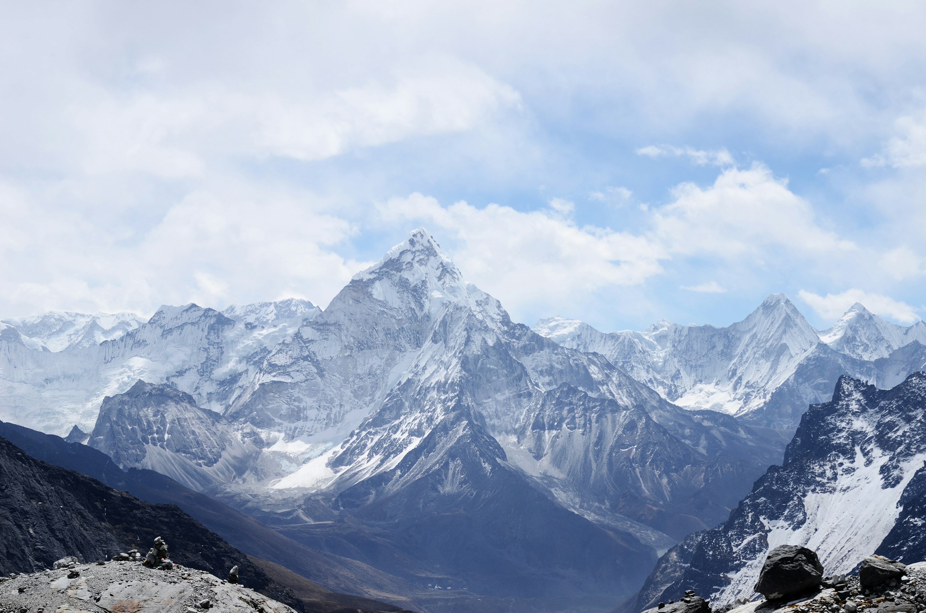

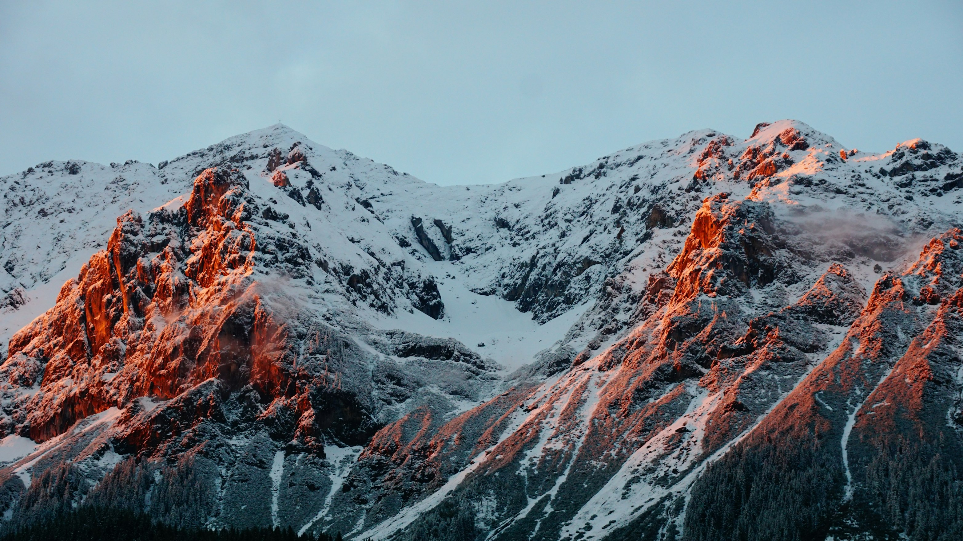

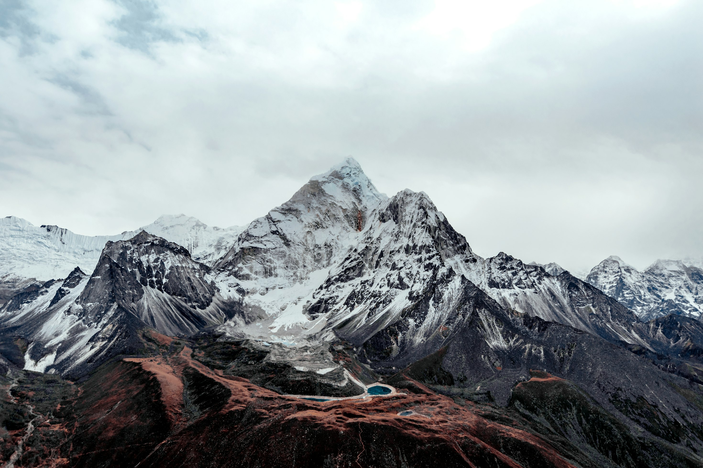

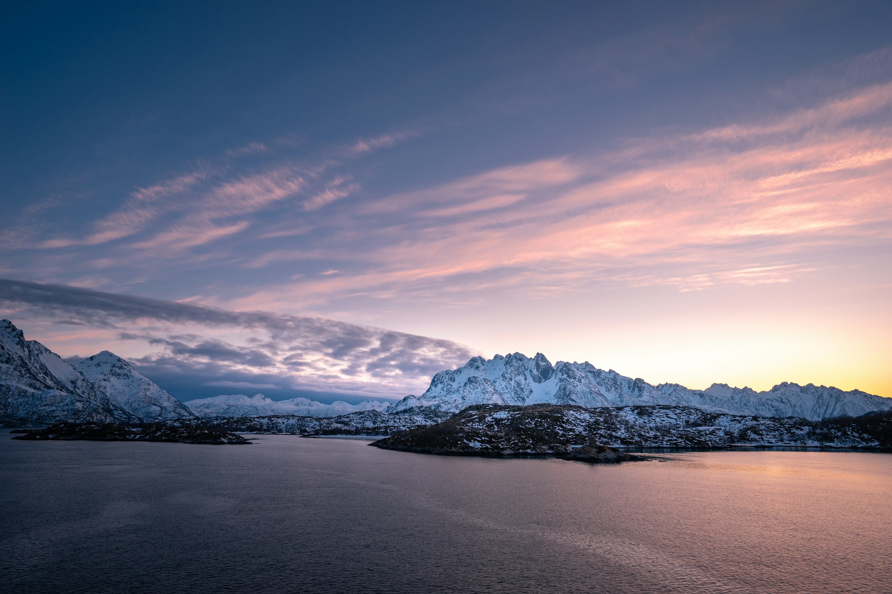
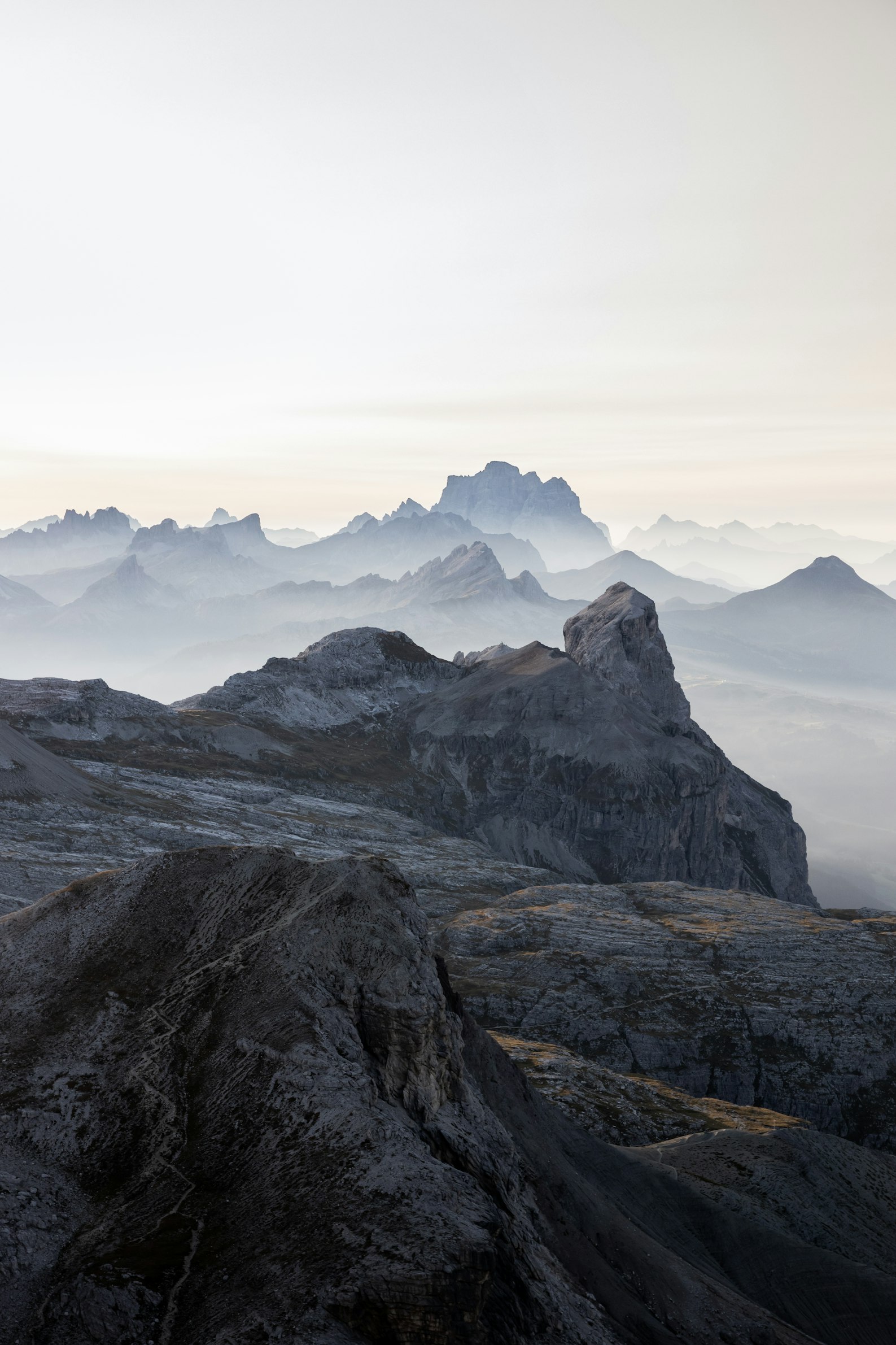

<div class="@container relative">
  <div class="absolute inset-0 -top-8 -bottom-8 grid grid-cols-3 gap-[5cqw]">
    <div class="bg-stripes"></div>
    <div class="bg-stripes"></div>
    <div class="bg-stripes"></div>
  </div>
  <div class="relative -mb-[5cqw] columns-3 gap-[5cqw] *:mb-[5cqw]">
    <img
      class="aspect-3/2 rounded-lg bg-black/5 object-cover outline -outline-offset-1 outline-black/10 dark:outline-0"
      src="https://images.unsplash.com/photo-1454496522488-7a8e488e8606?ixlib=rb-1.2.1&ixid=MnwxMjA3fDB8MHxwaG90by1wYWdlfHx8fGVufDB8fHx8&auto=format&fit=crop&w=2952&q=80"
    />
    <img
      class="aspect-square rounded-lg bg-black/5 object-cover outline -outline-offset-1 outline-black/10 dark:outline-0"
      src="https://images.unsplash.com/photo-1434394354979-a235cd36269d?ixlib=rb-1.2.1&ixid=MnwxMjA3fDB8MHxwaG90by1wYWdlfHx8fGVufDB8fHx8&auto=format&fit=crop&w=2902&q=80"
    />
    <img
      class="aspect-square rounded-lg bg-black/5 object-cover outline -outline-offset-1 outline-black/10 dark:outline-0"
      src="https://images.unsplash.com/photo-1491904768633-2b7e3e7fede5?ixlib=rb-1.2.1&ixid=MnwxMjA3fDB8MHxwaG90by1wYWdlfHx8fGVufDB8fHx8&auto=format&fit=crop&w=3131&q=80"
    />
    <img
      class="aspect-square rounded-lg bg-black/5 object-cover outline -outline-offset-1 outline-black/10 dark:outline-0"
      src="https://images.unsplash.com/photo-1463288889890-a56b2853c40f?ixlib=rb-1.2.1&ixid=MnwxMjA3fDB8MHxwaG90by1wYWdlfHx8fGVufDB8fHx8&auto=format&fit=crop&w=3132&q=80"
    />
    <img
      class="aspect-3/2 rounded-lg bg-black/5 object-cover outline -outline-offset-1 outline-black/10 dark:outline-0"
      src="https://images.unsplash.com/photo-1611605645802-c21be743c321?ixlib=rb-1.2.1&ixid=MnwxMjA3fDB8MHxwaG90by1wYWdlfHx8fGVufDB8fHx8&auto=format&fit=crop&w=2940&q=80"
    />
    <img
      class="aspect-square rounded-lg bg-black/5 object-cover outline -outline-offset-1 outline-black/10 dark:outline-0"
      src="https://images.unsplash.com/photo-1498603993951-8a027a8a8f84?ixlib=rb-1.2.1&ixid=MnwxMjA3fDB8MHxwaG90by1wYWdlfHx8fGVufDB8fHx8&auto=format&fit=crop&w=2936&q=80"
    />
    <img
      class="aspect-square rounded-lg bg-black/5 object-cover outline -outline-offset-1 outline-black/10 dark:outline-0"
      src="https://images.unsplash.com/photo-1526400473556-aac12354f3db?ixlib=rb-1.2.1&ixid=MnwxMjA3fDB8MHxwaG90by1wYWdlfHx8fGVufDB8fHx8&auto=format&fit=crop&w=2940&q=80"
    />
    <img
      class="aspect-square rounded-lg bg-black/5 object-cover outline -outline-offset-1 outline-black/10 dark:outline-0"
      src="https://images.unsplash.com/photo-1617369120004-4fc70312c5e6?ixlib=rb-1.2.1&ixid=MnwxMjA3fDB8MHxwaG90by1wYWdlfHx8fGVufDB8fHx8&auto=format&fit=crop&w=1587&q=80"
    />
    <img
      class="aspect-3/2 rounded-lg bg-black/5 object-cover outline -outline-offset-1 outline-black/10 dark:outline-0"
      src="https://images.unsplash.com/photo-1518892096458-a169843d7f7f?ixlib=rb-1.2.1&ixid=MnwxMjA3fDB8MHxwaG90by1wYWdlfHx8fGVufDB8fHx8&auto=format&fit=crop&w=2940&q=80"
    />
  </div>
</div>
Set columns by width
<div class="@container relative">
  <div class="absolute inset-0 -top-8 -bottom-8 grid grid-cols-1 gap-8 @[34rem]:grid-cols-2">
    <div class="bg-stripes"></div>
    <div class="bg-stripes"></div>
    <div class="bg-stripes @[34rem]:hidden"></div>
  </div>
  <div class="relative -mb-4 columns-2xs gap-4 *:mb-4 @sm:-mb-8 @sm:gap-8 @sm:*:mb-8">
    <img
      class="aspect-3/2 w-full rounded-lg bg-black/5 object-cover outline -outline-offset-1 outline-black/10 dark:outline-0"
      src="https://images.unsplash.com/photo-1454496522488-7a8e488e8606?ixlib=rb-1.2.1&ixid=MnwxMjA3fDB8MHxwaG90by1wYWdlfHx8fGVufDB8fHx8&auto=format&fit=crop&w=2952&q=80"
    />
    <img
      class="aspect-square w-full rounded-lg bg-black/5 object-cover outline -outline-offset-1 outline-black/10 dark:outline-0"
      src="https://images.unsplash.com/photo-1434394354979-a235cd36269d?ixlib=rb-1.2.1&ixid=MnwxMjA3fDB8MHxwaG90by1wYWdlfHx8fGVufDB8fHx8&auto=format&fit=crop&w=2902&q=80"
    />
    <img
      class="aspect-square w-full rounded-lg bg-black/5 object-cover outline -outline-offset-1 outline-black/10 dark:outline-0"
      src="https://images.unsplash.com/photo-1491904768633-2b7e3e7fede5?ixlib=rb-1.2.1&ixid=MnwxMjA3fDB8MHxwaG90by1wYWdlfHx8fGVufDB8fHx8&auto=format&fit=crop&w=3131&q=80"
    />
    <img
      class="aspect-3/2 w-full rounded-lg bg-black/5 object-cover outline -outline-offset-1 outline-black/10 dark:outline-0"
      src="https://images.unsplash.com/photo-1463288889890-a56b2853c40f?ixlib=rb-1.2.1&ixid=MnwxMjA3fDB8MHxwaG90by1wYWdlfHx8fGVufDB8fHx8&auto=format&fit=crop&w=3132&q=80"
    />
  </div>
</div>
Adjust the column gap
<div class="@container relative">
  <div class="absolute inset-0 -top-8 -bottom-8 grid grid-cols-[1fr_2rem_1fr_2rem_1fr]">
    <div></div>
    <div class="bg-stripes"></div>
    <div></div>
    <div class="bg-stripes"></div>
    <div></div>
  </div>
  <div class="relative -mb-8 columns-3 gap-8 *:mb-8">
    <img
      class="aspect-3/2 rounded-lg bg-black/5 object-cover outline -outline-offset-1 outline-black/10 dark:outline-0"
      src="https://images.unsplash.com/photo-1454496522488-7a8e488e8606?ixlib=rb-1.2.1&ixid=MnwxMjA3fDB8MHxwaG90by1wYWdlfHx8fGVufDB8fHx8&auto=format&fit=crop&w=2952&q=80"
    />
    <img
      class="aspect-square rounded-lg bg-black/5 object-cover outline -outline-offset-1 outline-black/10 dark:outline-0"
      src="https://images.unsplash.com/photo-1434394354979-a235cd36269d?ixlib=rb-1.2.1&ixid=MnwxMjA3fDB8MHxwaG90by1wYWdlfHx8fGVufDB8fHx8&auto=format&fit=crop&w=2902&q=80"
    />
    <img
      class="aspect-square rounded-lg bg-black/5 object-cover outline -outline-offset-1 outline-black/10 dark:outline-0"
      src="https://images.unsplash.com/photo-1491904768633-2b7e3e7fede5?ixlib=rb-1.2.1&ixid=MnwxMjA3fDB8MHxwaG90by1wYWdlfHx8fGVufDB8fHx8&auto=format&fit=crop&w=3131&q=80"
    />
    <img
      class="aspect-square rounded-lg bg-black/5 object-cover outline -outline-offset-1 outline-black/10 dark:outline-0"
      src="https://images.unsplash.com/photo-1463288889890-a56b2853c40f?ixlib=rb-1.2.1&ixid=MnwxMjA3fDB8MHxwaG90by1wYWdlfHx8fGVufDB8fHx8&auto=format&fit=crop&w=3132&q=80"
    />
    <img
      class="aspect-3/2 rounded-lg bg-black/5 object-cover outline -outline-offset-1 outline-black/10 dark:outline-0"
      src="https://images.unsplash.com/photo-1611605645802-c21be743c321?ixlib=rb-1.2.1&ixid=MnwxMjA3fDB8MHxwaG90by1wYWdlfHx8fGVufDB8fHx8&auto=format&fit=crop&w=2940&q=80"
    />
    <img
      class="aspect-square rounded-lg bg-black/5 object-cover outline -outline-offset-1 outline-black/10 dark:outline-0"
      src="https://images.unsplash.com/photo-1498603993951-8a027a8a8f84?ixlib=rb-1.2.1&ixid=MnwxMjA3fDB8MHxwaG90by1wYWdlfHx8fGVufDB8fHx8&auto=format&fit=crop&w=2936&q=80"
    />
    <img
      class="aspect-square rounded-lg bg-black/5 object-cover outline -outline-offset-1 outline-black/10 dark:outline-0"
      src="https://images.unsplash.com/photo-1526400473556-aac12354f3db?ixlib=rb-1.2.1&ixid=MnwxMjA3fDB8MHxwaG90by1wYWdlfHx8fGVufDB8fHx8&auto=format&fit=crop&w=2940&q=80"
    />
    <img
      class="aspect-square rounded-lg bg-black/5 object-cover outline -outline-offset-1 outline-black/10 dark:outline-0"
      src="https://images.unsplash.com/photo-1617369120004-4fc70312c5e6?ixlib=rb-1.2.1&ixid=MnwxMjA3fDB8MHxwaG90by1wYWdlfHx8fGVufDB8fHx8&auto=format&fit=crop&w=1587&q=80"
    />
    <img
      class="aspect-3/2 rounded-lg bg-black/5 object-cover outline -outline-offset-1 outline-black/10 dark:outline-0"
      src="https://images.unsplash.com/photo-1518892096458-a169843d7f7f?ixlib=rb-1.2.1&ixid=MnwxMjA3fDB8MHxwaG90by1wYWdlfHx8fGVufDB8fHx8&auto=format&fit=crop&w=2940&q=80"
    />
  </div>
</div>
Responsive column layouts
<div class="@container relative">
  <div class="absolute inset-0 -top-8 -bottom-8 grid grid-cols-2 gap-4 @sm:grid-cols-3 @sm:gap-8">
    <div class="bg-stripes"></div>
    <div class="bg-stripes"></div>
    <div class="bg-stripes @max-sm:hidden"></div>
  </div>
  <div class="relative columns-2 gap-4 *:mb-4 @sm:-mb-8 @sm:columns-3 @sm:gap-8 @sm:*:mb-8">
    <img
      class="aspect-3/2 rounded-lg bg-black/5 object-cover outline -outline-offset-1 outline-black/10 dark:outline-0"
      src="https://images.unsplash.com/photo-1454496522488-7a8e488e8606?ixlib=rb-1.2.1&ixid=MnwxMjA3fDB8MHxwaG90by1wYWdlfHx8fGVufDB8fHx8&auto=format&fit=crop&w=2952&q=80"
    />
    <img
      class="aspect-square rounded-lg bg-black/5 object-cover outline -outline-offset-1 outline-black/10 dark:outline-0"
      src="https://images.unsplash.com/photo-1434394354979-a235cd36269d?ixlib=rb-1.2.1&ixid=MnwxMjA3fDB8MHxwaG90by1wYWdlfHx8fGVufDB8fHx8&auto=format&fit=crop&w=2902&q=80"
    />
    <img
      class="aspect-square rounded-lg bg-black/5 object-cover outline -outline-offset-1 outline-black/10 dark:outline-0"
      src="https://images.unsplash.com/photo-1491904768633-2b7e3e7fede5?ixlib=rb-1.2.1&ixid=MnwxMjA3fDB8MHxwaG90by1wYWdlfHx8fGVufDB8fHx8&auto=format&fit=crop&w=3131&q=80"
    />
    <img
      class="aspect-square rounded-lg bg-black/5 object-cover outline -outline-offset-1 outline-black/10 dark:outline-0"
      src="https://images.unsplash.com/photo-1463288889890-a56b2853c40f?ixlib=rb-1.2.1&ixid=MnwxMjA3fDB8MHxwaG90by1wYWdlfHx8fGVufDB8fHx8&auto=format&fit=crop&w=3132&q=80"
    />
    <img
      class="aspect-3/2 rounded-lg bg-black/5 object-cover outline -outline-offset-1 outline-black/10 dark:outline-0"
      src="https://images.unsplash.com/photo-1611605645802-c21be743c321?ixlib=rb-1.2.1&ixid=MnwxMjA3fDB8MHxwaG90by1wYWdlfHx8fGVufDB8fHx8&auto=format&fit=crop&w=2940&q=80"
    />
    <img
      class="aspect-square rounded-lg bg-black/5 object-cover outline -outline-offset-1 outline-black/10 dark:outline-0"
      src="https://images.unsplash.com/photo-1498603993951-8a027a8a8f84?ixlib=rb-1.2.1&ixid=MnwxMjA3fDB8MHxwaG90by1wYWdlfHx8fGVufDB8fHx8&auto=format&fit=crop&w=2936&q=80"
    />
    <img
      class="aspect-square rounded-lg bg-black/5 object-cover outline -outline-offset-1 outline-black/10 dark:outline-0"
      src="https://images.unsplash.com/photo-1526400473556-aac12354f3db?ixlib=rb-1.2.1&ixid=MnwxMjA3fDB8MHxwaG90by1wYWdlfHx8fGVufDB8fHx8&auto=format&fit=crop&w=2940&q=80"
    />
    <img
      class="aspect-square rounded-lg bg-black/5 object-cover outline -outline-offset-1 outline-black/10 dark:outline-0"
      src="https://images.unsplash.com/photo-1617369120004-4fc70312c5e6?ixlib=rb-1.2.1&ixid=MnwxMjA3fDB8MHxwaG90by1wYWdlfHx8fGVufDB8fHx8&auto=format&fit=crop&w=1587&q=80"
    />
    <img
      class="aspect-3/2 rounded-lg bg-black/5 object-cover outline -outline-offset-1 outline-black/10 dark:outline-0"
      src="https://images.unsplash.com/photo-1518892096458-a169843d7f7f?ixlib=rb-1.2.1&ixid=MnwxMjA3fDB8MHxwaG90by1wYWdlfHx8fGVufDB8fHx8&auto=format&fit=crop&w=2940&q=80"
    />
  </div>
</div>
Image
DocsThe image component uses the native HTML img element to display images in your application. It supports responsive sizing, aspect ratios, and background images using Tailwind CSS utilities.
Basic example
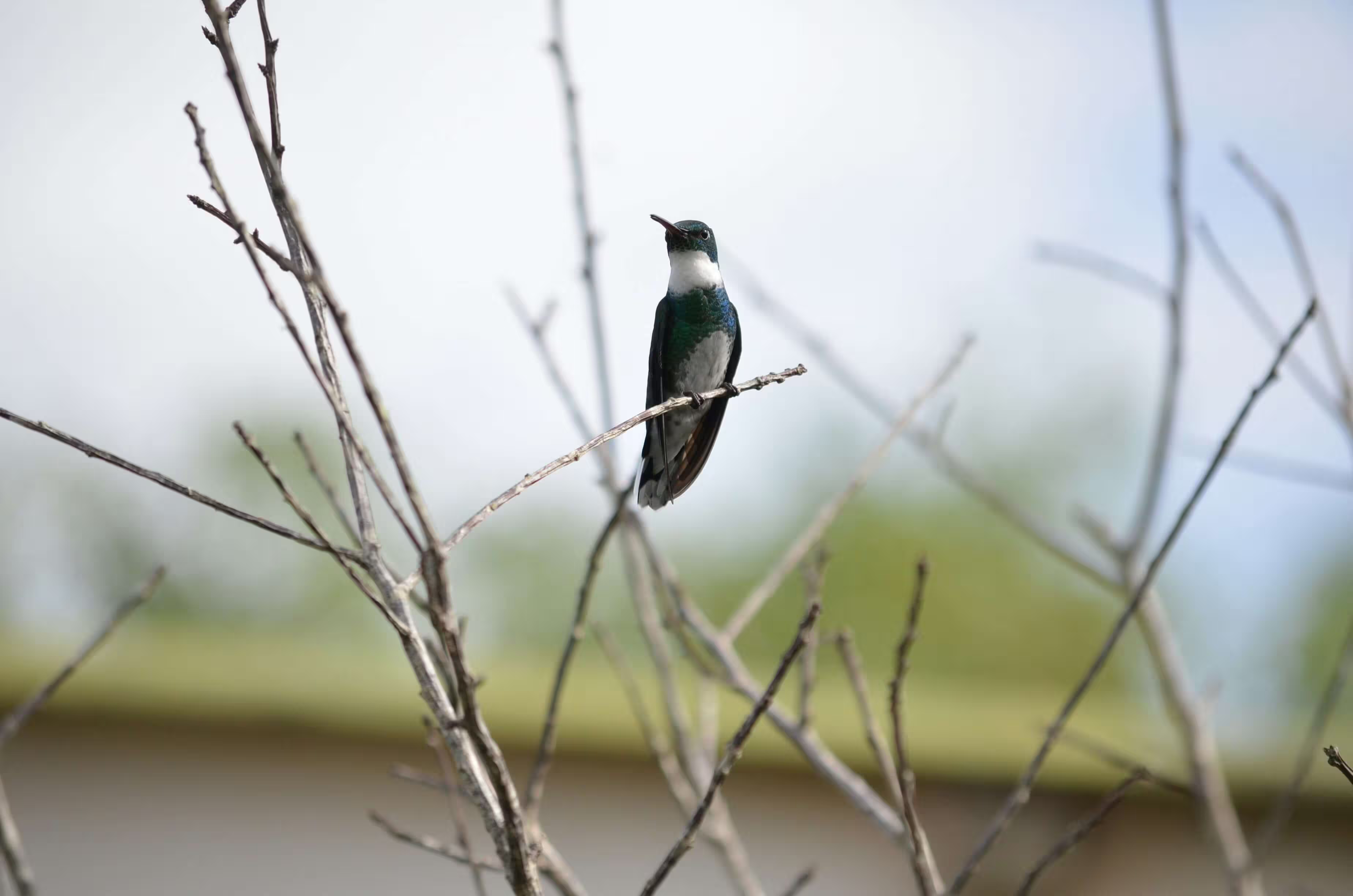
<img class="w-full rounded-lg" src="/images/2.avif" alt="Sample image" />Sizes
<img class="w-76 h-48 rounded-md" src="/images/2.avif" alt="Medium image" /><img class="size-48 object-cover rounded-md" src="/images/2.avif" alt="Medium image" />Aspect ratio
<img class="aspect-3/2 object-cover rounded-lg" src="/images/2.avif" alt="3:2 image" />Square aspect ratio
<img class="max-h-64 aspect-square object-cover rounded-lg" src="/images/2.avif" alt="Square image"/>Object fit
<figure class="w-72">
  <img
    src="/images/2.avif"
    alt="Contain example"
    class="h-40 w-full object-contain border border-default"
  />
  <figcaption class="mt-2 text-sm text-center">Object contain</figcaption>
</figure>

<figure class="w-72">
  <img
    src="/images/2.avif"
    alt="Contain example"
    class="h-40 w-full object-cover border border-default"
  />
  <figcaption class="mt-2 text-sm text-center">Object cover</figcaption>
</figure>
Image caption
<figure class="w-76">
  <img class="h-48 w-full object-cover rounded-lg" src="/images/2.avif" alt="Image caption" />
  <figcaption class="mt-2 text-sm text-center">Image caption</figcaption>
</figure>
Image mask
<div class="relative size-76">
  <div class="absolute inset-0 bg-default/40"></div>
  <img class="size-full object-cover" src="/images/2.avif" alt="Image caption" />
</div>
Colored mask
<div class="relative w-full h-76">
  <div class="absolute inset-0 bg-primary-light/50"></div>
  <img class="size-full object-cover" src="/images/2.avif" alt="Image caption" />
</div>

<div class="relative w-full h-76">
  <div class="absolute inset-0 bg-secondary-light/50"></div>
  <img class="size-full object-cover" src="/images/2.avif" alt="Image caption" />
</div>

<div class="relative w-full h-76">
  <div class="absolute inset-0 bg-info-light/50"></div>
  <img class="size-full object-cover" src="/images/2.avif" alt="Image caption" />
</div>

<div class="relative w-full h-76">
  <div class="absolute inset-0 bg-success-light/50"></div>
  <img class="size-full object-cover" src="/images/2.avif" alt="Image caption" />
</div>

<div class="relative w-full h-76">
  <div class="absolute inset-0 bg-warning-light/50"></div>
  <img class="size-full object-cover" src="/images/2.avif" alt="Image caption" />
</div>

<div class="relative w-full h-76">
  <div class="absolute inset-0 bg-danger-light/50"></div>
  <img class="size-full object-cover" src="/images/2.avif" alt="Image caption" />
</div>
Gradient mask
<div class="relative size-76">
  <div class="absolute inset-0 bg-linear-45 from-pink-400 via-green-500 to-sky-500 opacity-50"></div>
  <img class="size-full object-cover" src="/images/2.avif" alt="Image caption" />
</div>
Hover effect
Hello World!
<div class="relative size-76 overflow-hidden group">
  <div class="absolute inset-0 z-10 flex items-center justify-center bg-default opacity-0 transition duration-300 group-hover:opacity-70">
    <h6 class="uppercase">Hello World!</h6>
  </div>
  <img class="size-full object-cover transition duration-300 ease-in-out group-hover:scale-110" src="/images/2.avif" alt="Image caption" />
</div>
Custom styles
<img class="p-1 h-64 object-cover bg-default border border-default rounded-md hover:shadow-xl shadow-gray-200 dark:shadow-gray-800 transition duration-300 ease-in-out" src="/images/2.avif" alt="Styled image" />Responsive images
<img class="w-full sm:w-1/2 lg:w-1/3 rounded-lg" src="/images/2.avif" alt="Responsive image" />Accessibility
<img class="h-64 object-cover rounded-lg" src="/images/2.avif" alt="A hummingbird sitting on a flower" />Video
DocsThe video component uses the HTML5 video element to embed video content in your application. It supports various attributes and events to control playback and enhance user experience.
Basic example
<video controls class="w-full" poster="/videos/hummingbird-poster.webp" preload="metadata">
  <source src="/videos/hummingbird.mp4" type="video/mp4" />
  Your browser does not support the video tag.
</video>
Autoplay
<video controls autoplay muted class="w-full" poster="/videos/hummingbird-poster.webp" preload="metadata">
  <source src="/videos/hummingbird.mp4" type="video/mp4" />
  Your browser does not support the video tag.
</video>
Muted
<video controls muted class="w-full" poster="/videos/hummingbird-poster.webp" preload="metadata">
  <source src="/videos/hummingbird.mp4" type="video/mp4" />
  Your browser does not support the video tag.
</video>
Loop
<video controls loop class="w-full" poster="/videos/hummingbird-poster.webp" preload="metadata">
  <source src="/videos/hummingbird.mp4" type="video/mp4" />
  Your browser does not support the video tag.
</video>
Size
<video controls class="w-80 h-60 object-cover" poster="/videos/hummingbird-poster.webp" preload="metadata">
  <source src="/videos/hummingbird.mp4" type="video/mp4" />
  Your browser does not support the video tag.
</video>
Aspect ratio
<video controls class="aspect-video object-cover" poster="/videos/hummingbird-poster.webp" preload="metadata">
  <source src="/videos/hummingbird.mp4" type="video/mp4" />
  Your browser does not support the video tag.
</video>
Custom aspect ratio
<video controls class="aspect-4/3 object-cover" poster="/videos/hummingbird-poster.webp" preload="metadata">
  <source src="/videos/hummingbird.mp4" type="video/mp4" />
  Your browser does not support the video tag.
</video>
Custom styles
<video controls class="w-full max-w-150 rounded-lg border border-default" poster="/videos/hummingbird-poster.webp" preload="metadata">
  <source src="/videos/hummingbird.mp4" type="video/mp4" />
  Your browser does not support the video tag.
</video>
Background
DocsBackgrounds are the visual surfaces behind elements, created using colors, images, or gradients to establish context, contrast, and visual structure in a layout.
Background image
<div class="h-48 w-full bg-[url(/images/mountain.avif)] bg-cover bg-bottom rounded-lg"></div>Linear gradient
<div class="h-14 bg-linear-to-r from-cyan-500 to-blue-500 rounded-lg"></div>
<div class="h-14 bg-linear-120 from-emerald-400 to-green-600 rounded-lg"></div>
<div class="h-14 bg-linear-to-r from-rose-500 to-yellow-500 rounded-lg"></div>
<div class="h-14 bg-linear-to-t from-purple-500 to-pink-500 rounded-lg"></div>
Radial gradient
<div class="size-24 rounded-full bg-radial from-pink-400 from-40% to-fuchsia-700"></div>
<div class="size-24 rounded-full bg-radial-[at_50%_75%] from-sky-200 via-blue-400 to-indigo-900 to-90%"></div>
<div class="size-24 rounded-full bg-radial-[at_25%_25%] from-white to-zinc-900 to-75%"></div>
Conic gradient
<div class="size-24 rounded-full bg-conic from-blue-600 to-sky-400 to-50%"></div>
<div class="size-24 rounded-full bg-conic-180 from-indigo-600 via-indigo-50 to-indigo-600"></div>
<div class="size-24 rounded-full bg-conic/decreasing from-violet-700 via-lime-300 to-violet-700"></div>
Background image with overlay
<div class="relative h-48 w-full bg-[url(/images/mountain.avif)] bg-cover bg-bottom rounded-lg">
  <div class="absolute inset-0 bg-black/40 rounded-lg"></div>
  <div class="relative z-10 flex h-full items-center justify-center text-white text-2xl font-semibold">
    Background Image
  </div>
</div>
Background size
.bg-contain
.bg-cover
<div class="max-w-92 mx-auto">
  <p class="mb-1"><code>.bg-contain</code></p>
  <div class="h-40 w-full bg-[url(/images/mountain.avif)] bg-bottom bg-contain bg-no-repeat border border-default"></div>
</div>
<div class="max-w-92 mx-auto">
  <p class="mb-1"><code>.bg-cover</code></p>
  <div class="h-40 w-full bg-[url(/images/mountain.avif)] mx-auto bg-bottom bg-cover bg-no-repeat border border-default"></div>
</div>
Background position
bg-top-left

bg-top
bg-top-right
bg-left
bg-center
bg-right
bg-bottom-left
bg-bottom
bg-bottom-right
<div class="flex snap-x scroll-p-4 items-end overflow-x-scroll overflow-y-hidden p-8 pt-16 sm:grid sm:grid-cols-3 sm:gap-16">
  <div class="relative w-32 shrink-0 snap-start snap-always sm:w-auto">
    <p class="absolute inset-x-0 top-0 mb-3 -translate-y-8 text-center font-mono text-xs font-medium text-gray-500 dark:text-gray-400">
      bg-top-left
    </p>
    <div class="group relative mx-auto h-20 w-20 rounded-lg">
      <div class="relative z-10 h-full w-full rounded-md bg-[size:8rem] bg-top-left outline -outline-offset-1 outline-black/10" style="background-image: url(https://images.unsplash.com/photo-1589405858862-2ac9cbb41321?q=80&w=2070&auto=format&fit=crop&ixlib=rb-4.1.0&ixid=M3wxMjA3fDB8MHxwaG90by1wYWdlfHx8fGVufDB8fHx8fA%3D%3D)"></div>
      <img
        class="absolute top-0 left-0 h-32 w-32 max-w-none overflow-hidden rounded-md opacity-0 sm:group-hover:opacity-25"
        src="https://images.unsplash.com/photo-1589405858862-2ac9cbb41321?q=80&w=2070&auto=format&fit=crop&ixlib=rb-4.1.0&ixid=M3wxMjA3fDB8MHxwaG90by1wYWdlfHx8fGVufDB8fHx8fA%3D%3D"
      />
    </div>
  </div>
  <div class="relative w-32 shrink-0 snap-start snap-always sm:w-auto">
    <p class="absolute inset-x-0 top-0 mb-3 -translate-y-8 text-center font-mono text-xs font-medium text-gray-500 dark:text-gray-400">
      bg-top
    </p>
    <div class="group relative mx-auto h-20 w-20 rounded-lg">
      <div class="relative z-10 h-full w-full rounded-md bg-[size:8rem] bg-top outline -outline-offset-1 outline-black/10" style="background-image: url(https://images.unsplash.com/photo-1589405858862-2ac9cbb41321?q=80&w=2070&auto=format&fit=crop&ixlib=rb-4.1.0&ixid=M3wxMjA3fDB8MHxwaG90by1wYWdlfHx8fGVufDB8fHx8fA%3D%3D)"></div>
      <img
        class="absolute top-0 -left-6 h-32 w-32 max-w-none overflow-hidden rounded-md opacity-0 sm:group-hover:opacity-25"
        src="https://images.unsplash.com/photo-1589405858862-2ac9cbb41321?q=80&w=2070&auto=format&fit=crop&ixlib=rb-4.1.0&ixid=M3wxMjA3fDB8MHxwaG90by1wYWdlfHx8fGVufDB8fHx8fA%3D%3D"
      />
    </div>
  </div>
  <div class="relative w-32 shrink-0 snap-start snap-always sm:w-auto">
    <p class="absolute inset-x-0 top-0 mb-3 -translate-y-8 text-center font-mono text-xs font-medium text-gray-500 dark:text-gray-400">
      bg-top-right
    </p>
    <div class="group relative mx-auto h-20 w-20 rounded-lg">
      <div class="relative z-10 h-full w-full rounded-md bg-[size:8rem] bg-top-right outline -outline-offset-1 outline-black/10" style="background-image: url(https://images.unsplash.com/photo-1589405858862-2ac9cbb41321?q=80&w=2070&auto=format&fit=crop&ixlib=rb-4.1.0&ixid=M3wxMjA3fDB8MHxwaG90by1wYWdlfHx8fGVufDB8fHx8fA%3D%3D)"></div>
      <img
        class="absolute top-0 right-0 h-32 w-32 max-w-none overflow-hidden rounded-md opacity-0 sm:group-hover:opacity-25"
        src="https://images.unsplash.com/photo-1589405858862-2ac9cbb41321?q=80&w=2070&auto=format&fit=crop&ixlib=rb-4.1.0&ixid=M3wxMjA3fDB8MHxwaG90by1wYWdlfHx8fGVufDB8fHx8fA%3D%3D"
      />
    </div>
  </div>
  <div class="relative w-32 shrink-0 snap-start snap-always sm:w-auto">
    <p class="absolute inset-x-0 top-0 mb-3 -translate-y-8 text-center font-mono text-xs font-medium text-gray-500 dark:text-gray-400">
      bg-left
    </p>
    <div class="group relative mx-auto h-20 w-20 rounded-lg">
      <div class="relative z-10 h-full w-full rounded-md bg-[size:8rem] bg-left outline -outline-offset-1 outline-black/10" style="background-image: url(https://images.unsplash.com/photo-1589405858862-2ac9cbb41321?q=80&w=2070&auto=format&fit=crop&ixlib=rb-4.1.0&ixid=M3wxMjA3fDB8MHxwaG90by1wYWdlfHx8fGVufDB8fHx8fA%3D%3D)"></div>
      <img
        class="absolute -top-6 left-0 h-32 w-32 max-w-none overflow-hidden rounded-md opacity-0 sm:group-hover:opacity-25"
        src="https://images.unsplash.com/photo-1589405858862-2ac9cbb41321?q=80&w=2070&auto=format&fit=crop&ixlib=rb-4.1.0&ixid=M3wxMjA3fDB8MHxwaG90by1wYWdlfHx8fGVufDB8fHx8fA%3D%3D"
      />
    </div>
  </div>
  <div class="relative w-32 shrink-0 snap-start snap-always sm:w-auto">
    <p class="absolute inset-x-0 top-0 mb-3 -translate-y-8 text-center font-mono text-xs font-medium text-gray-500 dark:text-gray-400">
      bg-center
    </p>
    <div class="group relative mx-auto h-20 w-20 rounded-lg">
      <div class="relative z-10 h-full w-full rounded-md bg-[size:8rem] bg-center outline -outline-offset-1 outline-black/10" style="background-image: url(https://images.unsplash.com/photo-1589405858862-2ac9cbb41321?q=80&w=2070&auto=format&fit=crop&ixlib=rb-4.1.0&ixid=M3wxMjA3fDB8MHxwaG90by1wYWdlfHx8fGVufDB8fHx8fA%3D%3D)"></div>
      <img
        class="absolute -top-6 -left-6 h-32 w-32 max-w-none overflow-hidden rounded-md opacity-0 sm:group-hover:opacity-25"
        src="https://images.unsplash.com/photo-1589405858862-2ac9cbb41321?q=80&w=2070&auto=format&fit=crop&ixlib=rb-4.1.0&ixid=M3wxMjA3fDB8MHxwaG90by1wYWdlfHx8fGVufDB8fHx8fA%3D%3D"
      />
    </div>
  </div>
  <div class="relative w-32 shrink-0 snap-start snap-always sm:w-auto">
    <p class="absolute inset-x-0 top-0 mb-3 -translate-y-8 text-center font-mono text-xs font-medium text-gray-500 dark:text-gray-400">
      bg-right
    </p>
    <div class="group relative mx-auto h-20 w-20 rounded-lg">
      <div class="relative z-10 h-full w-full rounded-md bg-[size:8rem] bg-right outline -outline-offset-1 outline-black/10" style="background-image: url(https://images.unsplash.com/photo-1589405858862-2ac9cbb41321?q=80&w=2070&auto=format&fit=crop&ixlib=rb-4.1.0&ixid=M3wxMjA3fDB8MHxwaG90by1wYWdlfHx8fGVufDB8fHx8fA%3D%3D)"></div>
      <img
        class="absolute -top-6 right-0 h-32 w-32 max-w-none overflow-hidden rounded-md opacity-0 sm:group-hover:opacity-25"
        src="https://images.unsplash.com/photo-1589405858862-2ac9cbb41321?q=80&w=2070&auto=format&fit=crop&ixlib=rb-4.1.0&ixid=M3wxMjA3fDB8MHxwaG90by1wYWdlfHx8fGVufDB8fHx8fA%3D%3D"
      />
    </div>
  </div>
  <div class="relative w-32 shrink-0 snap-start snap-always sm:w-auto">
    <p class="absolute inset-x-0 top-0 mb-3 -translate-y-8 text-center font-mono text-xs font-medium text-gray-500 dark:text-gray-400">
      bg-bottom-left
    </p>
    <div class="group relative mx-auto h-20 w-20 rounded-lg">
      <div class="relative z-10 h-full w-full rounded-md bg-[size:8rem] bg-bottom-left outline -outline-offset-1 outline-black/10" style="background-image: url(https://images.unsplash.com/photo-1589405858862-2ac9cbb41321?q=80&w=2070&auto=format&fit=crop&ixlib=rb-4.1.0&ixid=M3wxMjA3fDB8MHxwaG90by1wYWdlfHx8fGVufDB8fHx8fA%3D%3D)"></div>
      <img
        class="absolute -top-12 left-0 h-32 w-32 max-w-none overflow-hidden rounded-md opacity-0 sm:group-hover:opacity-25"
        src="https://images.unsplash.com/photo-1589405858862-2ac9cbb41321?q=80&w=2070&auto=format&fit=crop&ixlib=rb-4.1.0&ixid=M3wxMjA3fDB8MHxwaG90by1wYWdlfHx8fGVufDB8fHx8fA%3D%3D"
      />
    </div>
  </div>
  <div class="relative w-32 shrink-0 snap-start snap-always sm:w-auto">
    <p class="absolute inset-x-0 top-0 mb-3 -translate-y-8 text-center font-mono text-xs font-medium text-gray-500 dark:text-gray-400">
      bg-bottom
    </p>
    <div class="group relative mx-auto h-20 w-20 rounded-lg">
      <div class="relative z-10 h-full w-full rounded-md bg-[size:8rem] bg-bottom outline -outline-offset-1 outline-black/10" style="background-image: url(https://images.unsplash.com/photo-1589405858862-2ac9cbb41321?q=80&w=2070&auto=format&fit=crop&ixlib=rb-4.1.0&ixid=M3wxMjA3fDB8MHxwaG90by1wYWdlfHx8fGVufDB8fHx8fA%3D%3D)"></div>
      <img
        class="absolute -top-12 -left-6 h-32 w-32 max-w-none overflow-hidden rounded-md opacity-0 sm:group-hover:opacity-25"
        src="https://images.unsplash.com/photo-1589405858862-2ac9cbb41321?q=80&w=2070&auto=format&fit=crop&ixlib=rb-4.1.0&ixid=M3wxMjA3fDB8MHxwaG90by1wYWdlfHx8fGVufDB8fHx8fA%3D%3D"
      />
    </div>
  </div>
  <div class="relative -mx-8 w-48 shrink-0 snap-start snap-always sm:w-auto">
    <p class="absolute inset-x-0 top-0 mb-3 -translate-y-8 text-center font-mono text-xs font-medium text-gray-500 dark:text-gray-400">
      bg-bottom-right
    </p>
    <div class="group relative mx-auto h-20 w-20 rounded-lg">
      <div class="relative z-10 h-full w-full rounded-md bg-[size:8rem] bg-bottom-right outline -outline-offset-1 outline-black/10" style="background-image: url(https://images.unsplash.com/photo-1589405858862-2ac9cbb41321?q=80&w=2070&auto=format&fit=crop&ixlib=rb-4.1.0&ixid=M3wxMjA3fDB8MHxwaG90by1wYWdlfHx8fGVufDB8fHx8fA%3D%3D)"></div>
      <img
        class="absolute -top-12 right-0 h-32 w-32 max-w-none overflow-hidden rounded-md opacity-0 sm:group-hover:opacity-25"
        src="https://images.unsplash.com/photo-1589405858862-2ac9cbb41321?q=80&w=2070&auto=format&fit=crop&ixlib=rb-4.1.0&ixid=M3wxMjA3fDB8MHxwaG90by1wYWdlfHx8fGVufDB8fHx8fA%3D%3D"
      />
    </div>
  </div>
</div>
Background attachment
Maybe we can live without libraries, people like you and me. Maybe. Sure, we're too old to change the world, but what about that kid, sitting down, opening a book, right now, in a branch at the local library and finding drawings of pee-pees and wee-wees on the Cat in the Hat and the Five Chinese Brothers? Doesn't HE deserve better?
Look. If you think this is about overdue fines and missing books, you'd better think again. This is about that kid's right to read a book without getting his mind warped! Or: maybe that turns you on, Seinfeld; maybe that's how y'get your kicks. You and your good-time buddies.
<div class="mx-auto h-80 overflow-y-scroll bg-cover bg-center" style="background-image: url(https://images.unsplash.com/photo-1589405858862-2ac9cbb41321?q=80&w=2070&auto=format&fit=crop&ixlib=rb-4.1.0&ixid=M3wxMjA3fDB8MHxwaG90by1wYWdlfHx8fGVufDB8fHx8fA%3D%3D)">
  <div class="mt-48">
    <div class="p-4 sm:p-8 border-x border-default bg-default">
      <div class="mb-1 text-2xl font-extrabold tracking-tight">
        My trip to the summit
      </div>
      <div class="mb-4 text-sm font-medium text-gray-500">November 16, 2021 · 4 min read</div>
      <p class="mb-4 leading-7">
        Maybe we can live without libraries, people like you and me. Maybe. Sure, we're too old to change the world,
        but what about that kid, sitting down, opening a book, right now, in a branch at the local library and
        finding drawings of pee-pees and wee-wees on the Cat in the Hat and the Five Chinese Brothers? Doesn't HE
        deserve better?
      </p>
      <p class="leading-7">
        Look. If you think this is about overdue fines and missing books, you'd better think again. This is about
        that kid's right to read a book without getting his mind warped! Or: maybe that turns you on, Seinfeld;
        maybe that's how y'get your kicks. You and your good-time buddies.
      </p>
    </div>
  </div>
</div>
Scrolling with the container
Because the mail never stops. It just keeps coming and coming and coming, there's never a let-up. It's relentless. Every day it piles up more and more and more. And you gotta get it out but the more you get it out the more it keeps coming in. And then the barcode reader breaks and it's Publisher's Clearing House day.
<div class="h-64 overflow-y-scroll bg-cover bg-local" style="background-image: url(https://images.unsplash.com/photo-1589405858862-2ac9cbb41321?q=80&w=2070&auto=format&fit=crop&ixlib=rb-4.1.0&ixid=M3wxMjA3fDB8MHxwaG90by1wYWdlfHx8fGVufDB8fHx8fA%3D%3D)">
<div class="min-h-full bg-black/40 p-8 sm:px-16 sm:py-12">
<p class="text-center font-serif text-xl leading-6 text-white italic sm:text-2xl sm:leading-8">
Because the mail never stops. It just keeps coming and coming and coming, there's never a let-up. It's
relentless. Every day it piles up more and more and more. And you gotta get it out but the more you get it
out the more it keeps coming in. And then the barcode reader breaks and it's Publisher's Clearing House day.
</p>
<div class="font-inter mt-6 text-center text-sm font-bold text-white sm:text-base">— Newman</div>
</div>
</div>Scrolling with the viewport
Because the mail never stops. It just keeps coming and coming and coming, there's never a let-up. It's relentless. Every day it piles up more and more and more. And you gotta get it out but the more you get it out the more it keeps coming in. And then the barcode reader breaks and it's Publisher's Clearing House day.
<div class="h-64 overflow-y-scroll bg-cover bg-scroll" style="background-image: url(https://images.unsplash.com/photo-1589405858862-2ac9cbb41321?q=80&w=2070&auto=format&fit=crop&ixlib=rb-4.1.0&ixid=M3wxMjA3fDB8MHxwaG90by1wYWdlfHx8fGVufDB8fHx8fA%3D%3D)">
<div class="min-h-full bg-black/40 p-8 sm:px-16 sm:py-12">
<p class="text-center font-serif text-xl leading-6 text-white italic sm:text-2xl sm:leading-8">
Because the mail never stops. It just keeps coming and coming and coming, there's never a let-up. It's
relentless. Every day it piles up more and more and more. And you gotta get it out but the more you get it
out the more it keeps coming in. And then the barcode reader breaks and it's Publisher's Clearing House day.
</p>
<div class="font-inter mt-6 text-center text-sm font-bold text-white sm:text-base">— Newman</div>
</div>
</div>Shadows
DocsShadows simulate elevation and depth by adding soft or sharp outlines around elements.
Box shadow
.shadow-none.shadow-2xs.shadow-xs.shadow-sm.shadow-md.shadow-lg.shadow-xl.shadow-2xl.shadow-2xl/5.shadow-2xl/10<div class="shadow-none"><code>.shadow-none</code></div>
<div class="shadow-2xs"><code>.shadow-2xs</code></div>
<div class="shadow-xs"><code>.shadow-xs</code></div>
<div class="shadow-sm"><code>.shadow-sm</code></div>
<div class="shadow-md"><code>.shadow-md</code></div>
<div class="shadow-lg"><code>.shadow-lg</code></div>
<div class="shadow-xl"><code>.shadow-xl</code></div>
<div class="shadow-2xl"><code>.shadow-2xl</code></div>
<div class="shadow-2xl/5"><code>.shadow-2xl/5</code></div>
<div class="shadow-2xl/10"><code>.shadow-2xl/10</code></div>Shadow color
<div class="shadow-sm shadow-primary-light/50 bg-primary-lighter"></div>
<div class="shadow-sm shadow-secondary-light/50 bg-secondary-lighter"></div>
<div class="shadow-sm shadow-info-light/50 bg-info-lighter"></div>
<div class="shadow-sm shadow-success-light/50 bg-success-lighter"></div>
<div class="shadow-sm shadow-warning-light/50 bg-warning-lighter"></div>
<div class="shadow-sm shadow-danger-light/50 bg-danger-lighter"></div>
Shadow on hover
<div class="hover:shadow-sm hover:shadow-primary-light/50 bg-primary-lighter"></div>
<div class="hover:shadow-sm hover:shadow-secondary-light/50 bg-secondary-lighter"></div>
<div class="hover:shadow-sm hover:shadow-info-light/50 bg-info-lighter"></div>
<div class="hover:shadow-sm hover:shadow-success-light/50 bg-success-lighter"></div>
<div class="hover:shadow-sm hover:shadow-warning-light/50 bg-warning-lighter"></div>
<div class="hover:shadow-sm hover:shadow-danger-light/50 bg-danger-lighter"></div>
Inset shadow
<div class="inset-shadow-sm inset-shadow-primary-light/50 bg-primary-lighter"></div>
<div class="inset-shadow-sm inset-shadow-secondary-light/50 bg-secondary-lighter"></div>
<div class="inset-shadow-sm inset-shadow-info-light/50 bg-info-lighter"></div>
<div class="inset-shadow-sm inset-shadow-success-light/50 bg-success-lighter"></div>
<div class="inset-shadow-sm inset-shadow-warning-light/50 bg-warning-lighter"></div>
<div class="inset-shadow-sm inset-shadow-danger-light/50 bg-danger-lighter"></div>
Ring
<div class="ring-2 ring-primary-light/50 bg-primary-lighter"></div>
<div class="ring-2 ring-secondary-light/50 bg-secondary-lighter"></div>
<div class="ring-2 ring-info-light/50 bg-info-lighter"></div>
<div class="ring-2 ring-success-light/50 bg-success-lighter"></div>
<div class="ring-2 ring-warning-light/50 bg-warning-lighter"></div>
<div class="ring-2 ring-danger-light/50 bg-danger-lighter"></div>
Drop shadow
drop-shadow-md
drop-shadow-lg
drop-shadow-xl
drop-shadow-2xl
drop-shadow-2xl/25
drop-shadow-2xl/50
<div class="flex flex-col items-center">
  <p class="mb-3 text-center font-mono text-xs font-medium text-gray-500">drop-shadow-md</p>
  <svg class="size-28 drop-shadow-md" viewBox="0 0 84 84"
    ><path d="M22.0992 77L2.19922 42.5L22.0992 8H61.8992L81.7992 42.5L61.8992 77H22.0992Z" class="fill-white"
    ></path>
  </svg>
</div>

<div class="flex flex-col items-center">
  <p class="mb-3 text-center font-mono text-xs font-medium text-gray-500">drop-shadow-lg</p>
  <svg class="size-28 drop-shadow-lg" viewBox="0 0 84 84"
    ><path d="M22.0992 77L2.19922 42.5L22.0992 8H61.8992L81.7992 42.5L61.8992 77H22.0992Z" class="fill-white"
    ></path>
  </svg>
</div>

<div class="flex flex-col items-center">
  <p class="mb-3 text-center font-mono text-xs font-medium text-gray-500">drop-shadow-xl</p>
  <svg class="size-28 drop-shadow-xl" viewBox="0 0 84 84"
    ><path d="M22.0992 77L2.19922 42.5L22.0992 8H61.8992L81.7992 42.5L61.8992 77H22.0992Z" class="fill-white"
    ></path>
  </svg>
</div>

<div class="flex flex-col items-center">
  <p class="mb-3 text-center font-mono text-xs font-medium text-gray-500">drop-shadow-2xl</p>
  <svg class="size-28 drop-shadow-2xl" viewBox="0 0 84 84"
    ><path d="M22.0992 77L2.19922 42.5L22.0992 8H61.8992L81.7992 42.5L61.8992 77H22.0992Z" class="fill-white"
    ></path>
  </svg>
</div>

<div class="flex flex-col items-center">
  <p class="mb-3 text-center font-mono text-xs font-medium text-gray-500">drop-shadow-2xl/25</p>
  <svg class="size-28 drop-shadow-2xl/25" viewBox="0 0 84 84"
    ><path d="M22.0992 77L2.19922 42.5L22.0992 8H61.8992L81.7992 42.5L61.8992 77H22.0992Z" class="fill-white"
    ></path>
  </svg>
</div>

<div class="flex flex-col items-center">
  <p class="mb-3 text-center font-mono text-xs font-medium text-gray-500">drop-shadow-2xl/50</p>
  <svg class="size-28 drop-shadow-2xl/50" viewBox="0 0 84 84"
    ><path d="M22.0992 77L2.19922 42.5L22.0992 8H61.8992L81.7992 42.5L61.8992 77H22.0992Z" class="fill-white"
    ></path>
  </svg>
</div>
Shadow color
drop-shadow-primary-light
drop-shadow-secondary-light
drop-shadow-info-light
drop-shadow-success-light
drop-shadow-warning-light
drop-shadow-danger-light
<div class="flex flex-col items-center">
  <p class="mb-3 text-center font-mono text-xs font-medium text-gray-500">drop-shadow-primary-light</p>
  <svg class="size-28 drop-shadow-2xl drop-shadow-primary-light" viewBox="0 0 84 84">
    <path d="M22.0992 77L2.19922 42.5L22.0992 8H61.8992L81.7992 42.5L61.8992 77H22.0992Z" class="fill-primary-light"
    ></path>
  </svg>
</div>
<div class="flex flex-col items-center">
  <p class="mb-3 text-center font-mono text-xs font-medium text-gray-500">drop-shadow-secondary-light</p>
  <svg class="size-28 drop-shadow-2xl drop-shadow-secondary-light" viewBox="0 0 84 84">
    <path d="M22.0992 77L2.19922 42.5L22.0992 8H61.8992L81.7992 42.5L61.8992 77H22.0992Z" class="fill-secondary-light"
    ></path>
  </svg>
</div>
<div class="flex flex-col items-center">
  <p class="mb-3 text-center font-mono text-xs font-medium text-gray-500">drop-shadow-info-light</p>
  <svg class="size-28 drop-shadow-2xl drop-shadow-info-light" viewBox="0 0 84 84">
    <path d="M22.0992 77L2.19922 42.5L22.0992 8H61.8992L81.7992 42.5L61.8992 77H22.0992Z" class="fill-info-light"
    ></path>
  </svg>
</div>
<div class="flex flex-col items-center">
  <p class="mb-3 text-center font-mono text-xs font-medium text-gray-500">drop-shadow-success-light</p>
  <svg class="size-28 drop-shadow-2xl drop-shadow-success-light" viewBox="0 0 84 84">
    <path d="M22.0992 77L2.19922 42.5L22.0992 8H61.8992L81.7992 42.5L61.8992 77H22.0992Z" class="fill-success-light"
    ></path>
  </svg>
</div>
<div class="flex flex-col items-center">
  <p class="mb-3 text-center font-mono text-xs font-medium text-gray-500">drop-shadow-warning-light</p>
  <svg class="size-28 drop-shadow-2xl drop-shadow-warning-light" viewBox="0 0 84 84">
    <path d="M22.0992 77L2.19922 42.5L22.0992 8H61.8992L81.7992 42.5L61.8992 77H22.0992Z" class="fill-warning-light"
    ></path>
  </svg>
</div>
<div class="flex flex-col items-center">
  <p class="mb-3 text-center font-mono text-xs font-medium text-gray-500">drop-shadow-danger-light</p>
  <svg class="size-28 drop-shadow-2xl drop-shadow-danger-light" viewBox="0 0 84 84">
    <path d="M22.0992 77L2.19922 42.5L22.0992 8H61.8992L81.7992 42.5L61.8992 77H22.0992Z" class="fill-danger-light"
    ></path>
  </svg>
</div>
Shadow on hover
drop-shadow-primary-light
drop-shadow-secondary-light
drop-shadow-info-light
drop-shadow-success-light
drop-shadow-warning-light
drop-shadow-danger-light
<div class="flex flex-col items-center">
  <p class="mb-3 text-center font-mono text-xs font-medium text-gray-500">drop-shadow-primary-light</p>
  <svg class="size-28 hover:drop-shadow-2xl hover:drop-shadow-primary-light" viewBox="0 0 84 84">
    <path d="M22.0992 77L2.19922 42.5L22.0992 8H61.8992L81.7992 42.5L61.8992 77H22.0992Z" class="fill-primary-light"
    ></path>
  </svg>
</div>
<div class="flex flex-col items-center">
  <p class="mb-3 text-center font-mono text-xs font-medium text-gray-500">drop-shadow-secondary-light</p>
  <svg class="size-28 hover:drop-shadow-2xl hover:drop-shadow-secondary-light" viewBox="0 0 84 84">
    <path d="M22.0992 77L2.19922 42.5L22.0992 8H61.8992L81.7992 42.5L61.8992 77H22.0992Z" class="fill-secondary-light"
    ></path>
  </svg>
</div>
<div class="flex flex-col items-center">
  <p class="mb-3 text-center font-mono text-xs font-medium text-gray-500">drop-shadow-info-light</p>
  <svg class="size-28 hover:drop-shadow-2xl hover:drop-shadow-info-light" viewBox="0 0 84 84">
    <path d="M22.0992 77L2.19922 42.5L22.0992 8H61.8992L81.7992 42.5L61.8992 77H22.0992Z" class="fill-info-light"
    ></path>
  </svg>
</div>
<div class="flex flex-col items-center">
  <p class="mb-3 text-center font-mono text-xs font-medium text-gray-500">drop-shadow-success-light</p>
  <svg class="size-28 hover:drop-shadow-2xl hover:drop-shadow-success-light" viewBox="0 0 84 84">
    <path d="M22.0992 77L2.19922 42.5L22.0992 8H61.8992L81.7992 42.5L61.8992 77H22.0992Z" class="fill-success-light"
    ></path>
  </svg>
</div>
<div class="flex flex-col items-center">
  <p class="mb-3 text-center font-mono text-xs font-medium text-gray-500">drop-shadow-warning-light</p>
  <svg class="size-28 hover:drop-shadow-2xl hover:drop-shadow-warning-light" viewBox="0 0 84 84">
    <path d="M22.0992 77L2.19922 42.5L22.0992 8H61.8992L81.7992 42.5L61.8992 77H22.0992Z" class="fill-warning-light"
    ></path>
  </svg>
</div>
<div class="flex flex-col items-center">
  <p class="mb-3 text-center font-mono text-xs font-medium text-gray-500">drop-shadow-danger-light</p>
  <svg class="size-28 hover:drop-shadow-2xl hover:drop-shadow-danger-light" viewBox="0 0 84 84">
    <path d="M22.0992 77L2.19922 42.5L22.0992 8H61.8992L81.7992 42.5L61.8992 77H22.0992Z" class="fill-danger-light"
    ></path>
  </svg>
</div>